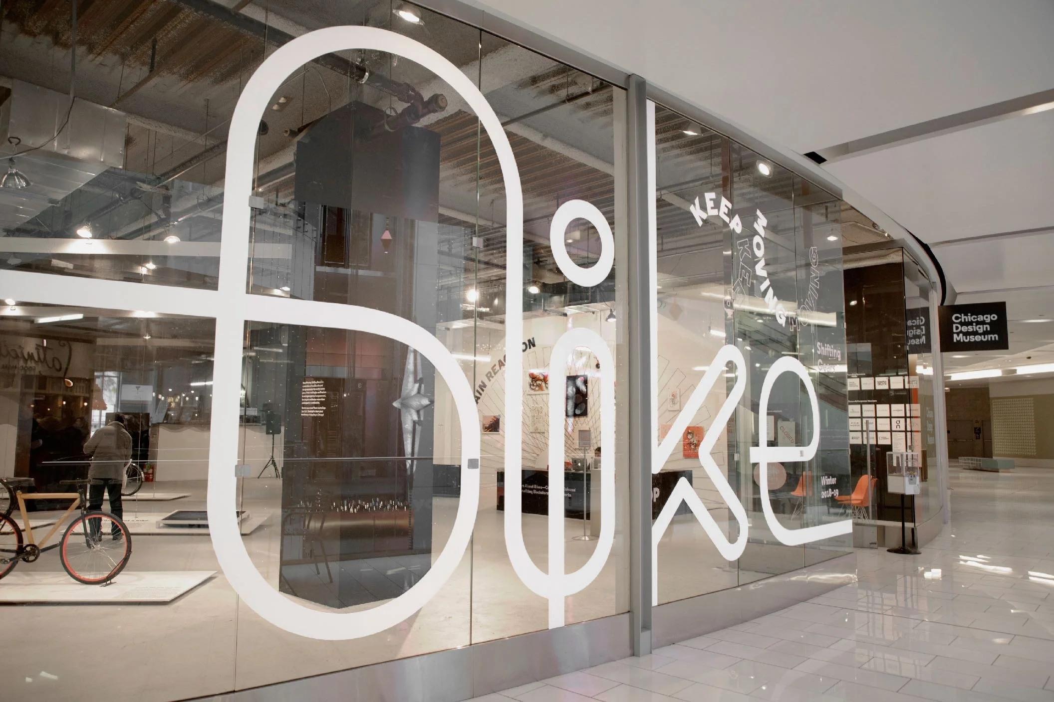
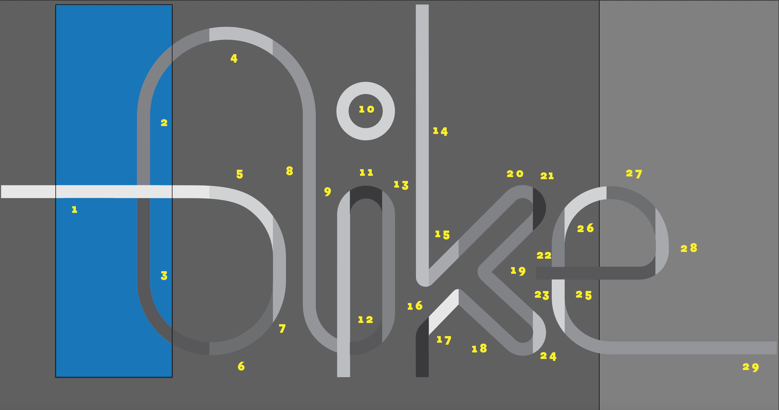
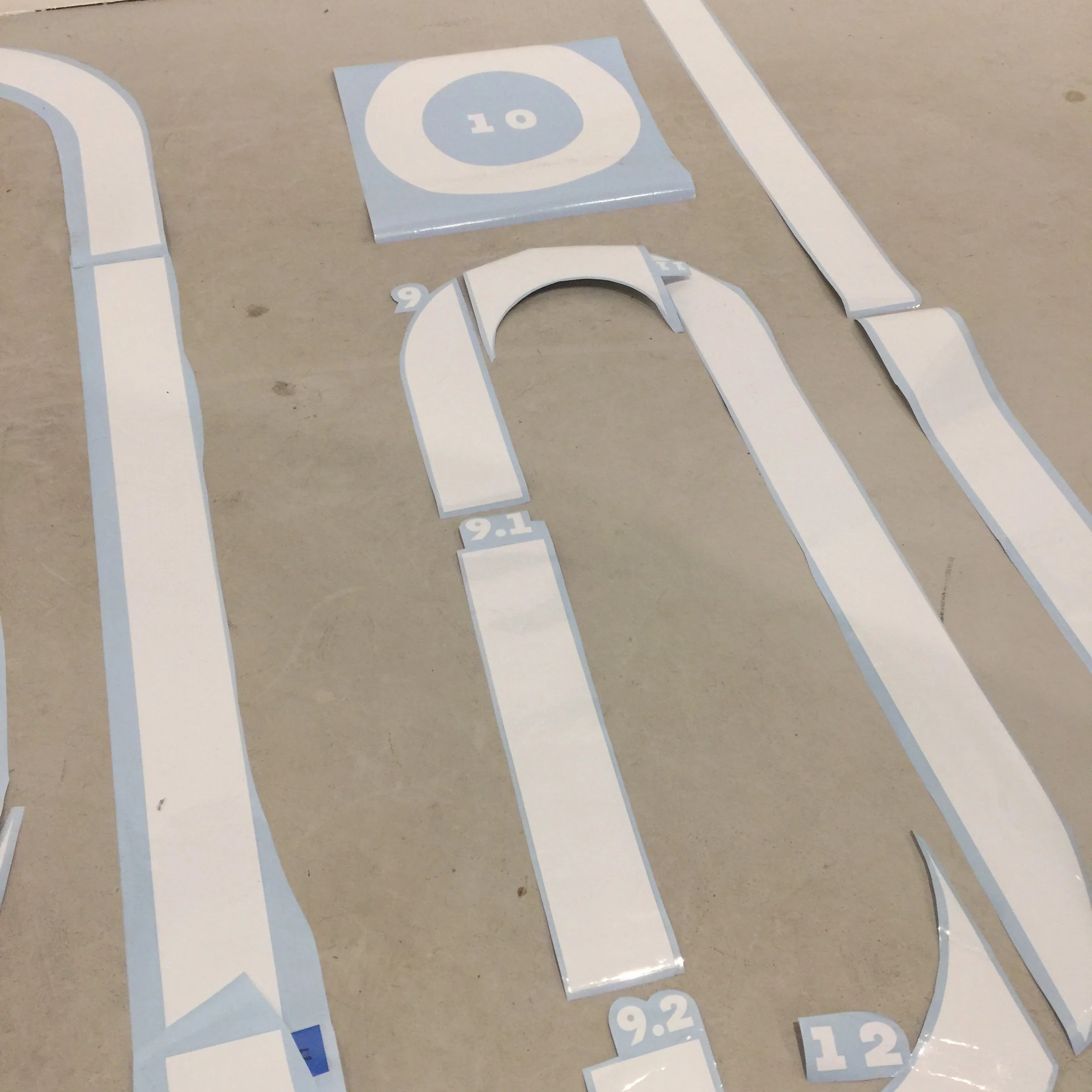
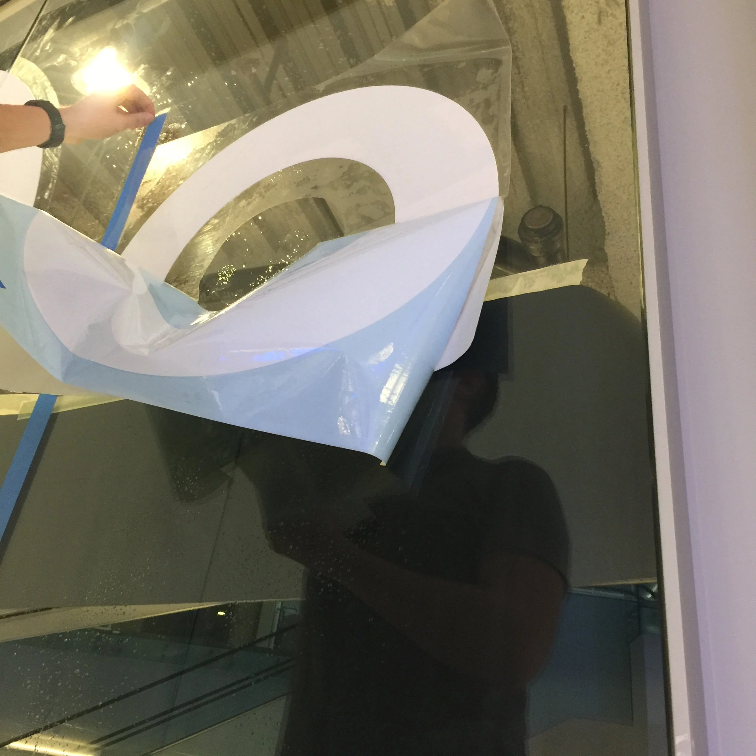
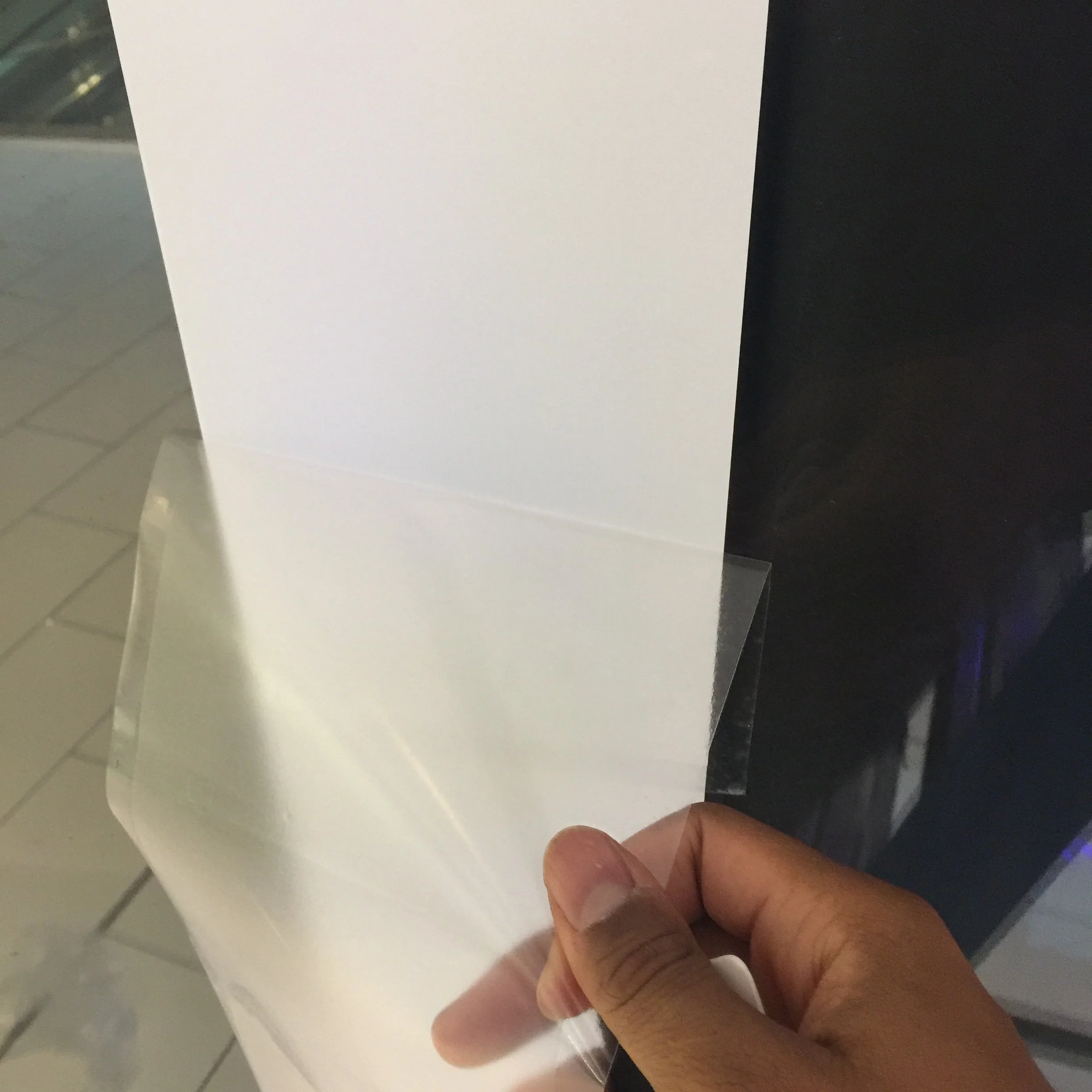
In my closing year of undergrad, I was entrusted with the task of designing a site-specific window graphic for the Keep Moving: Shifting Gears companion exhibit. The graphic needed to be scaled-up large enough to bring visibility to the museum, yet minimal in its design so that the greater portion of the glass would remain exposed.
After rounds upon rounds of exploration, I finally settled on these proud-standing letterforms—each inspired by the effortless flow of biking, and the many paths that can be found along the ride.
[ 001 ]
DESIGN MUSEUM
OF CHICAGO
Exhibition Design
Print Media
Public Work
Typography
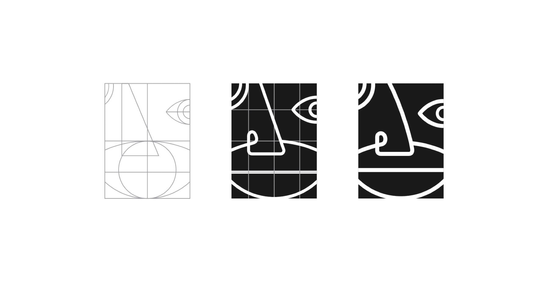

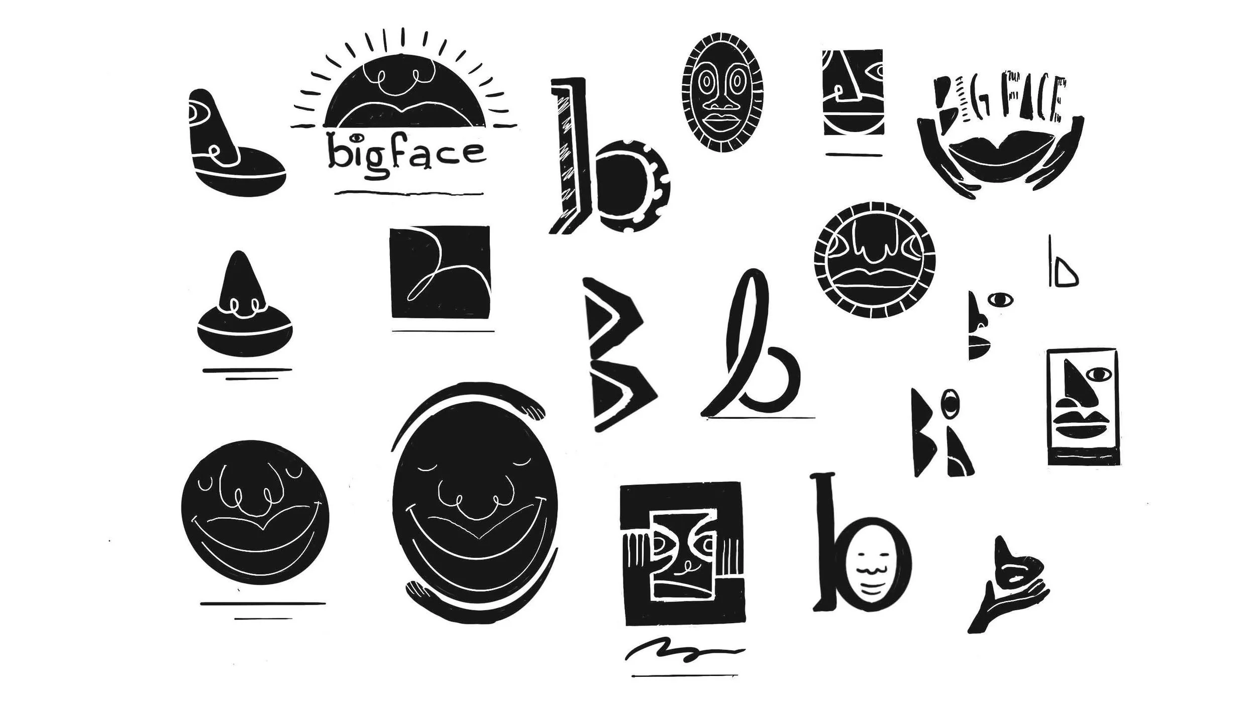
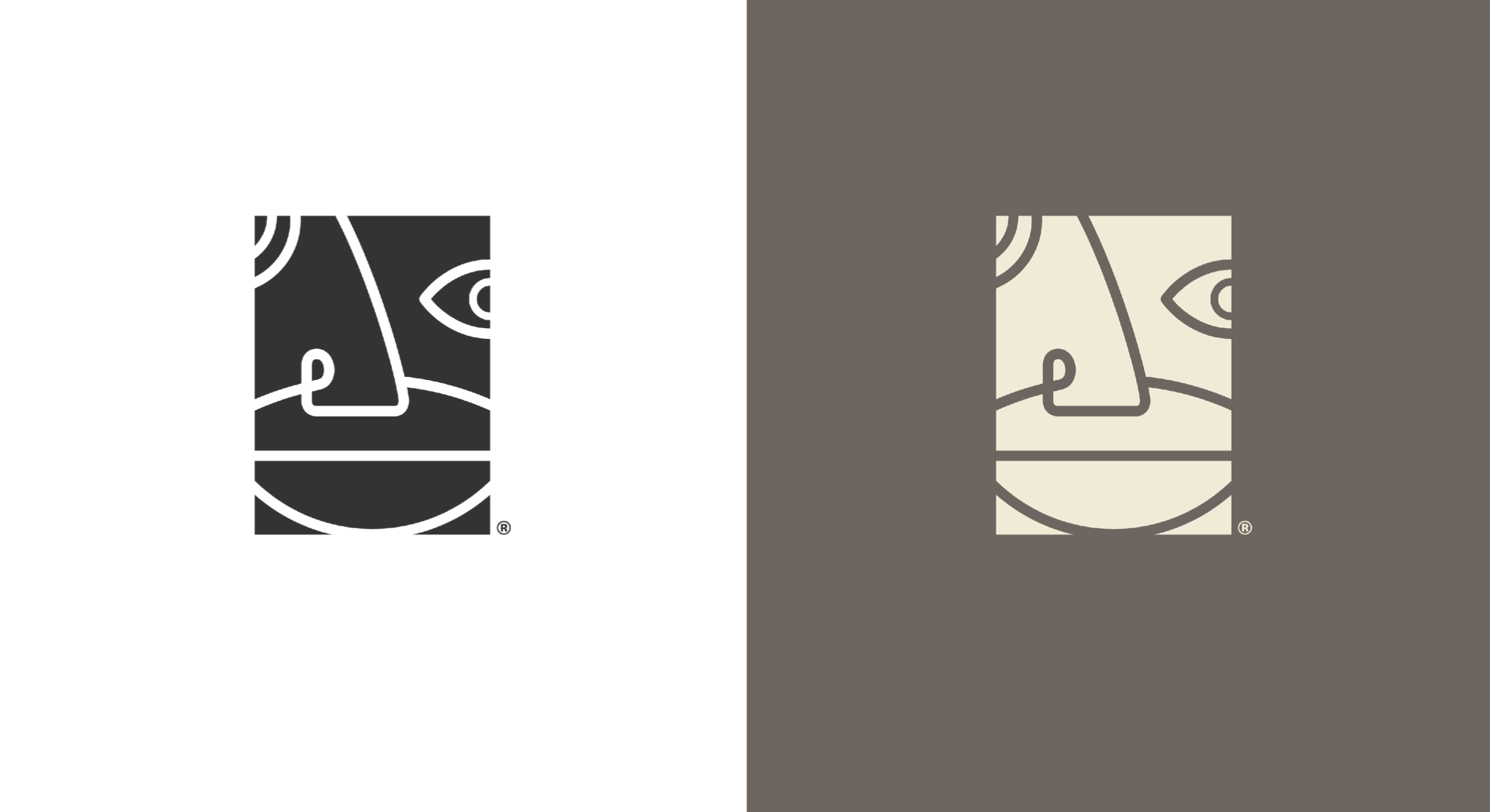
Black-owned start-up Bigface Beauty, celebrates the full features and richly melanated skin types that, too often, go undersupported by products in the skin-care industry. During the initial briefing Bigface founder—Aidenn Isaiah, shared with me his story about growing up Black, and not having the vocabulary to explain his features to the ‘other’ kids.
Able to relate, I dug deep to find the logo and logotype designs that best aligned with the long-term intent of the brand. The opportunity presented a chance to not only better acquaint myself with brand identity work, but to learn more about advocating for Black and Brown skin.
[ 002 ]
BIGFACE BEAUTY
Brand Identity
Logo Design
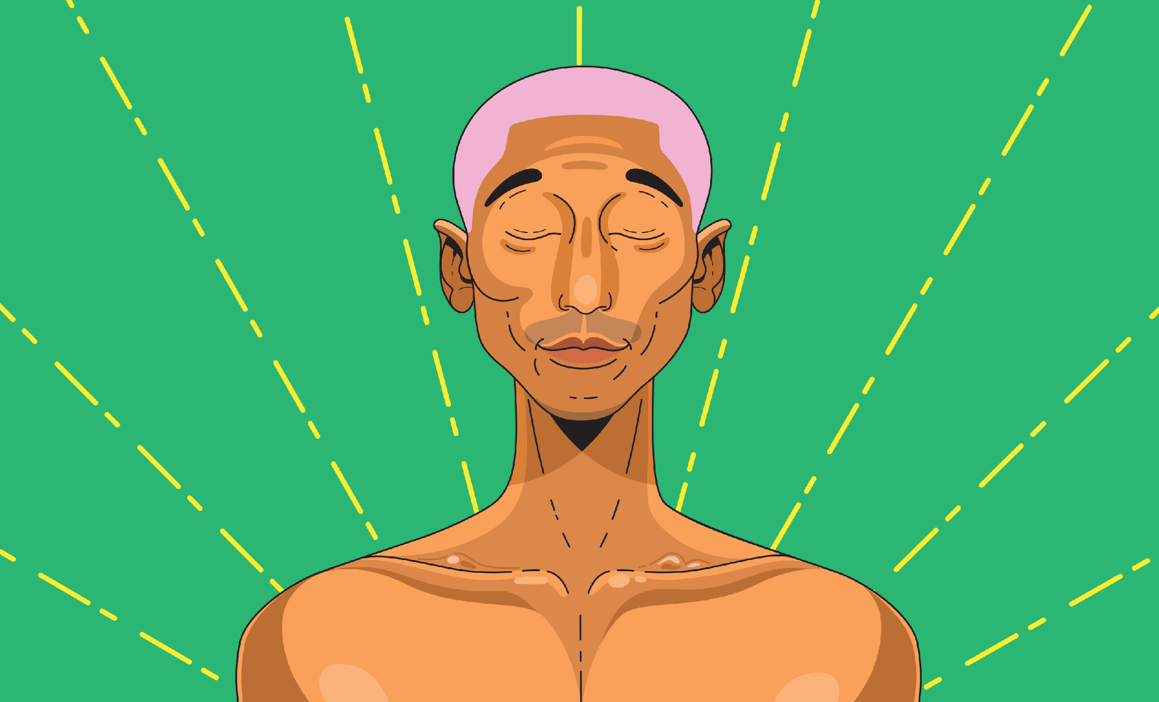
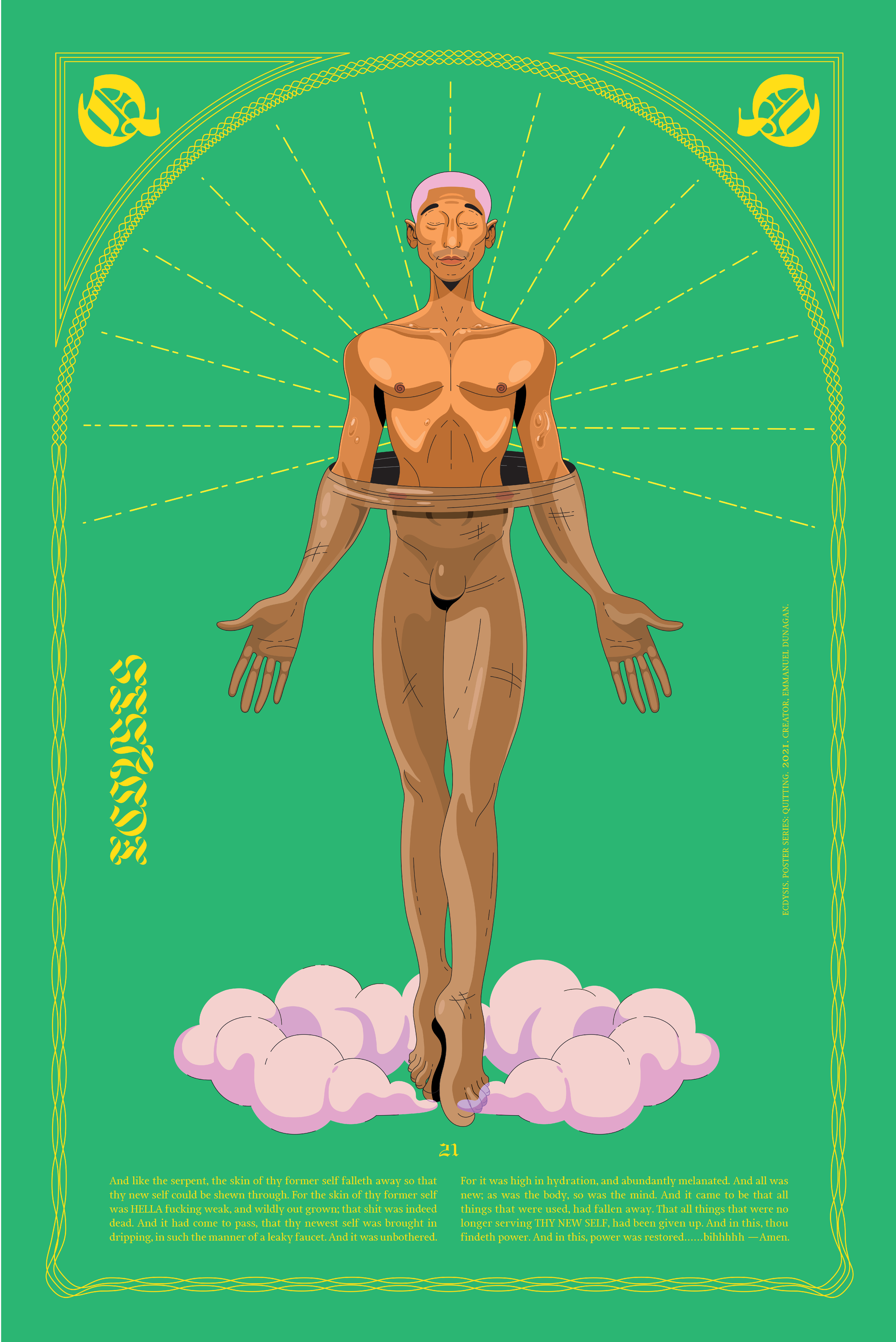
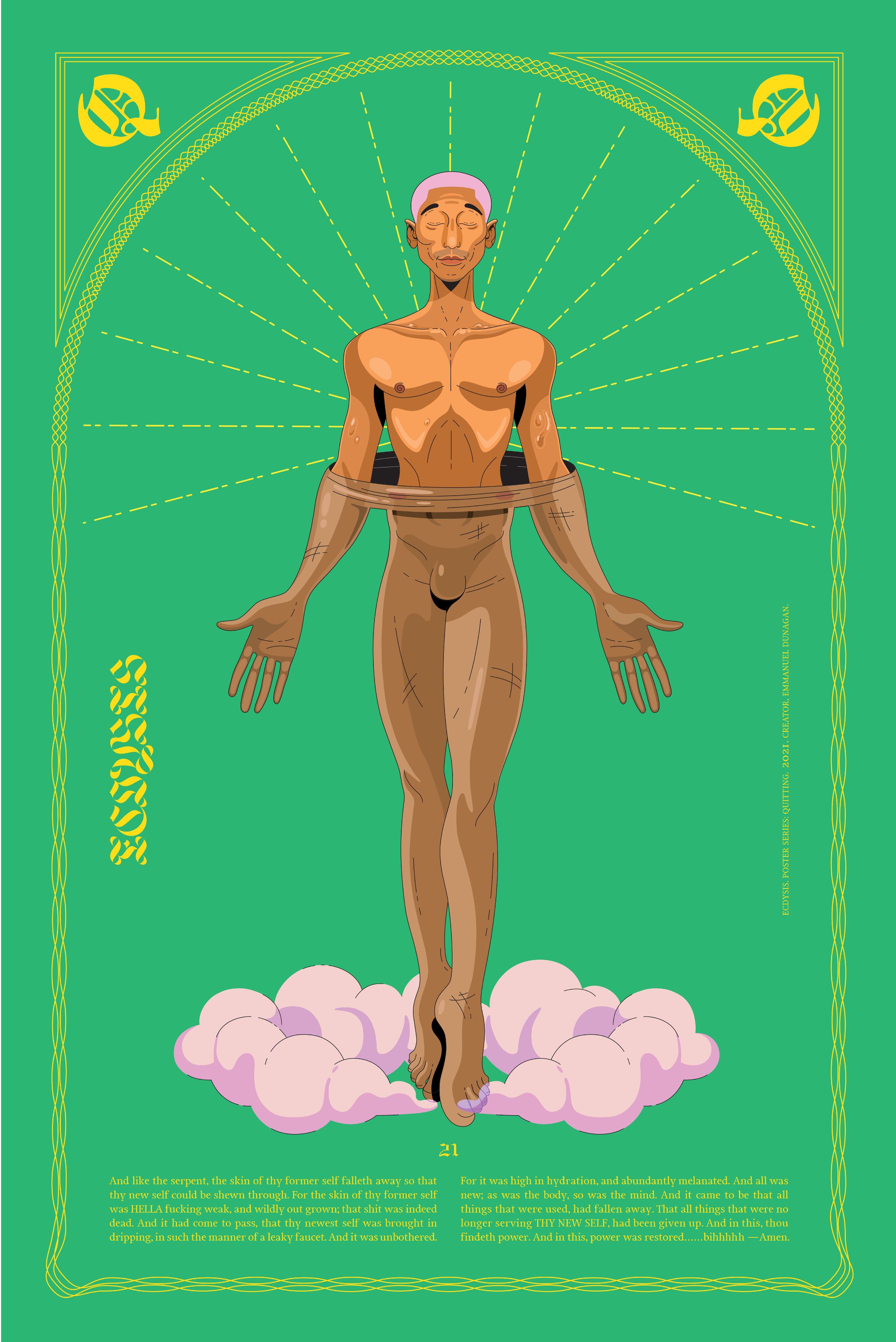
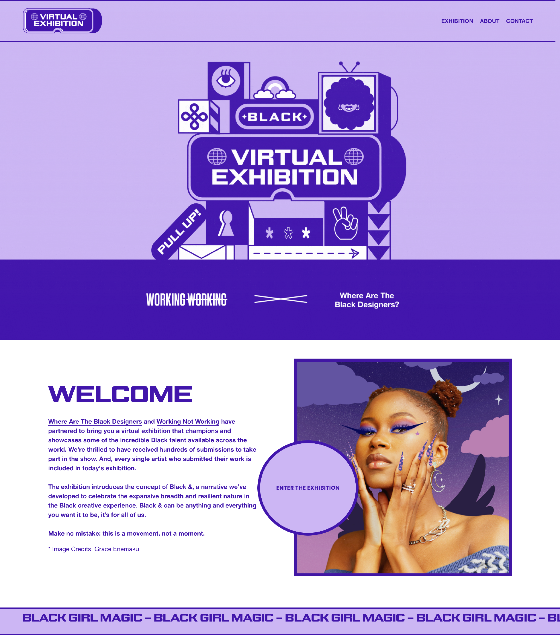
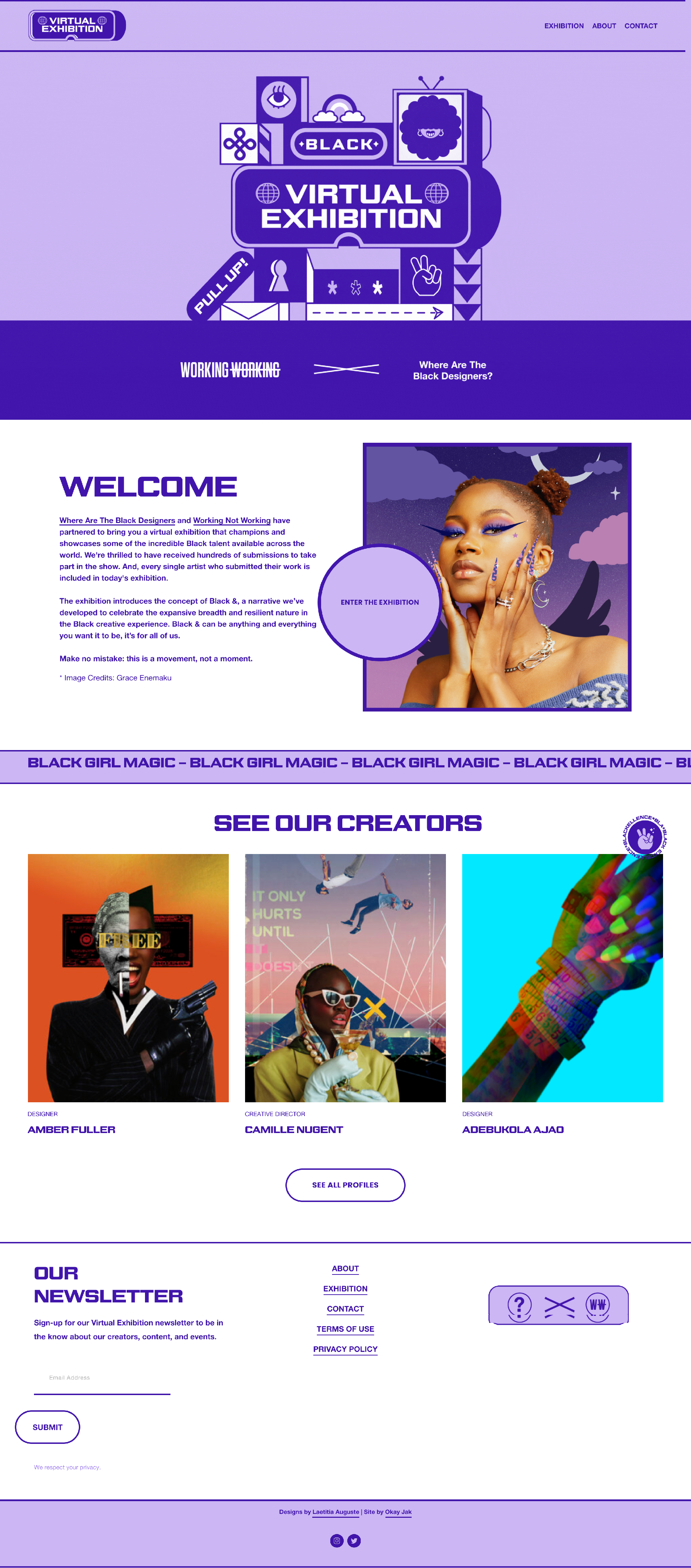
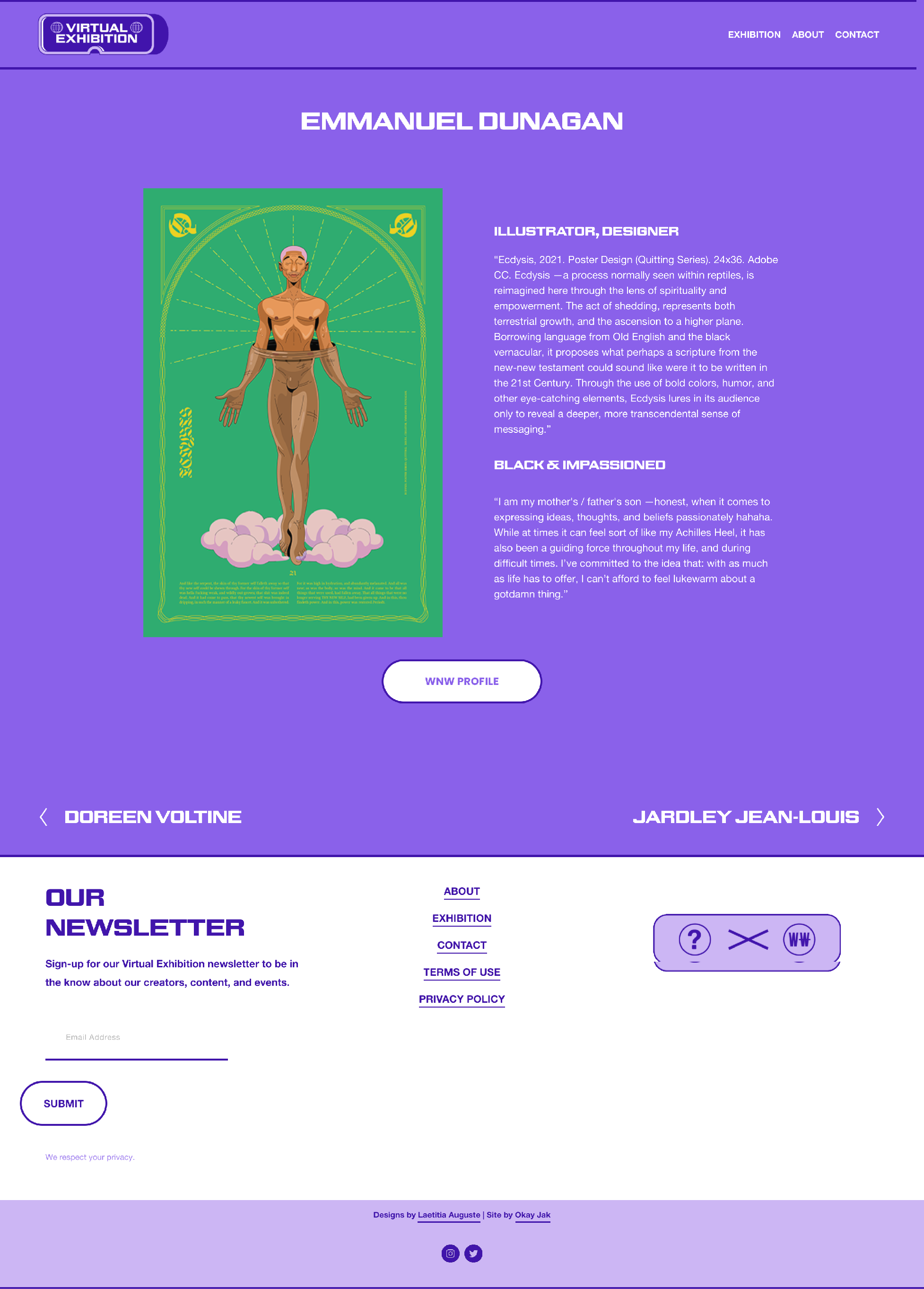
Quitting—as some might define it, is the act of giving up or admitting to some form of defeat. As such, ‘people who quit’ tend to be regarded as losers, wanderers, weaklings, or altogether less-ambitious persons. And yet, there are thousands of stories recalling times in which people were able to increase their quality of life, just by making a pivot.
In the Fall of 2020, myself and a few peers banded together to start a design collective that would eventually find the name Quitters. Here, we would define a space that allowed us to move, make, and speak freely, whilst exploring ‘quitting’ as an act of empowerment.
[ 003 ]
WATBD X QUITTERS
Poster Design
Virtual Exhibition
Illustration

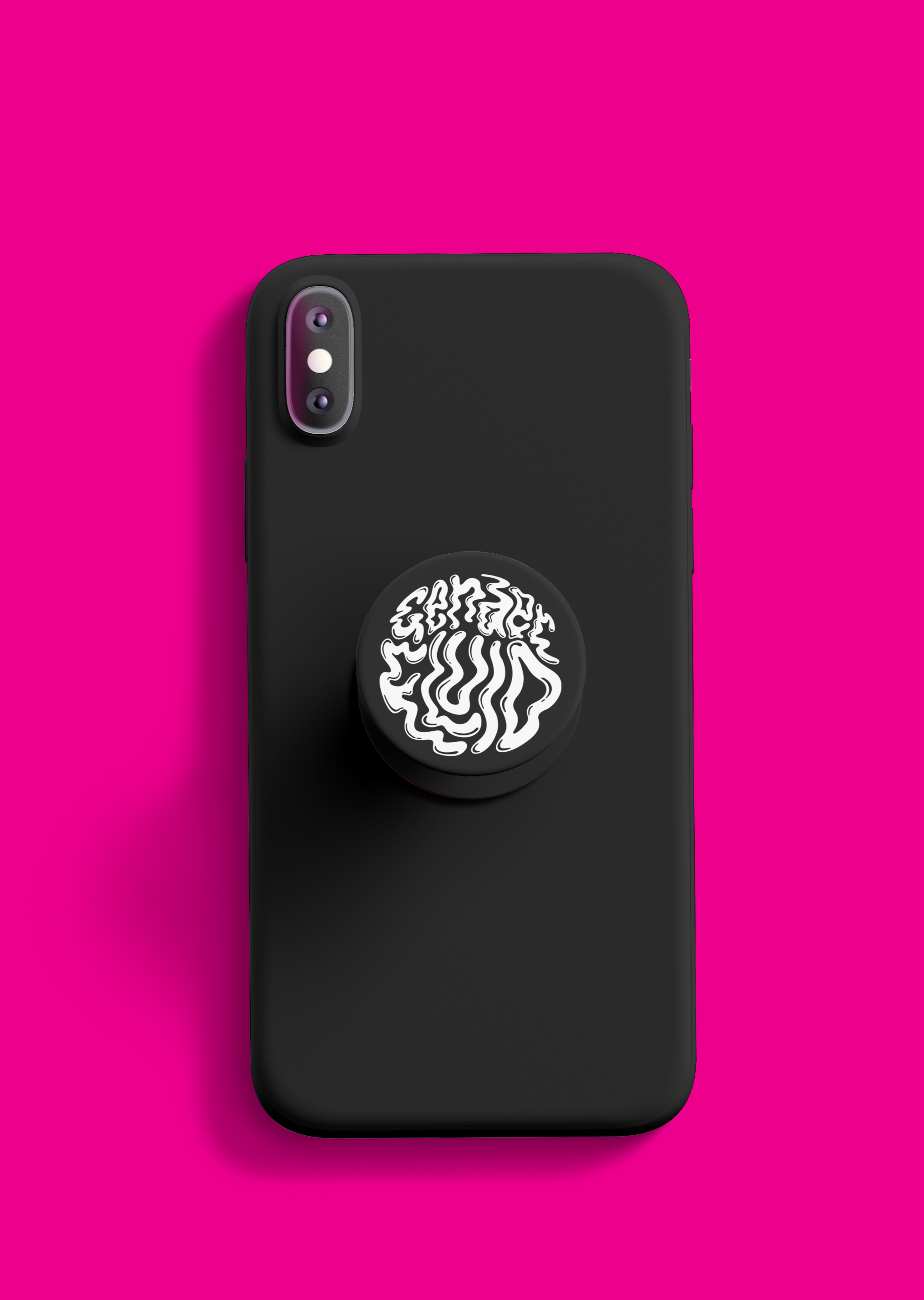
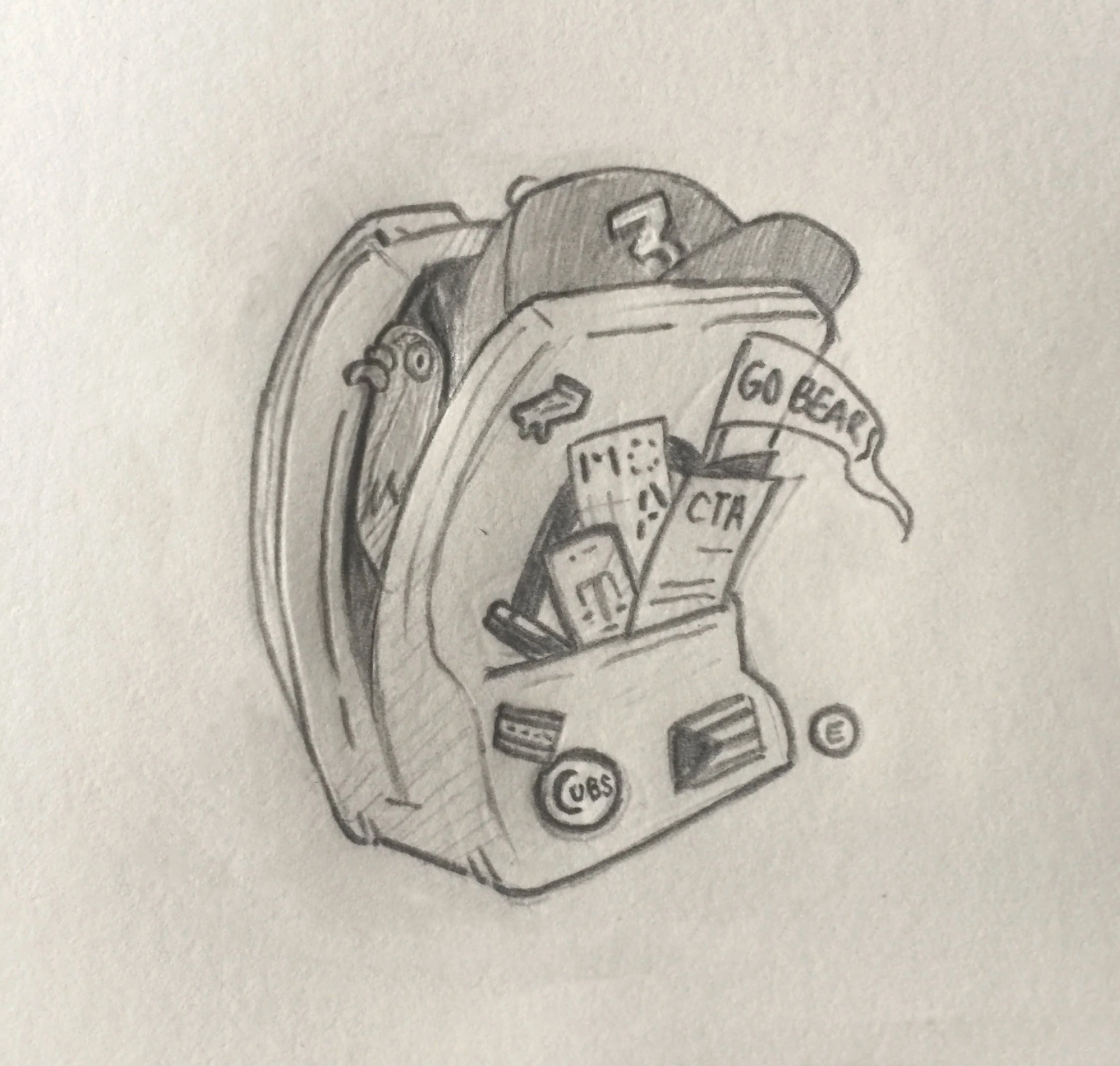
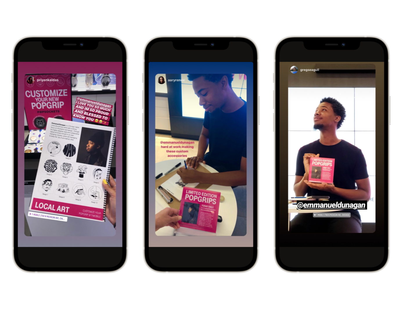
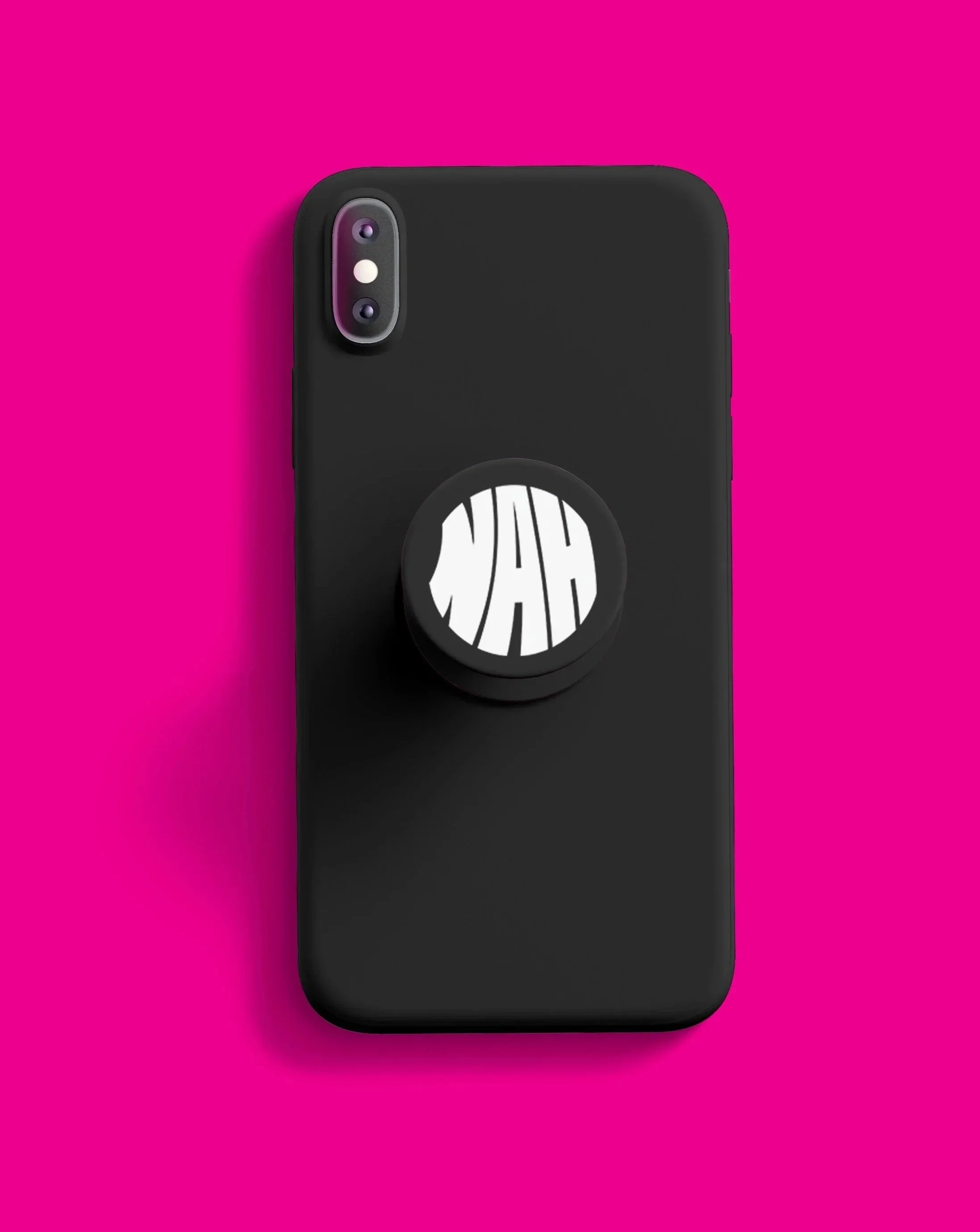
Tanner Woodford—good friend and founder of the Design Museum of Chicago—put into my ear that T-mobile was looking for a local designer/graphic artist for their in-store activation.
The ask was that I create (10) age appropriate designs to be featured within a larger catalogue, and spend four hours on-site, drawing live at the Magnificent Mile location. Customers were thus able to select a design, and have it etched into their pop-grips/mobile accessories using Glowforge® technology. Amid cramped hands and an empty belly, I managed to survive the full 4-hours—certain that the love and support I received was what helped to hold me over til lunch.
[ 004 ]
TMOBILE
Brand Activation
Graphic Art
Illustration
Product Design
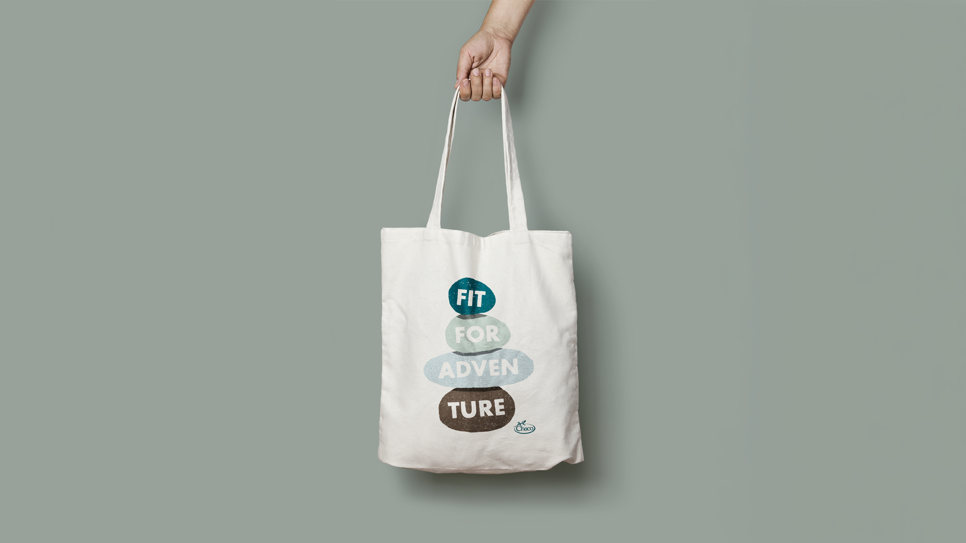
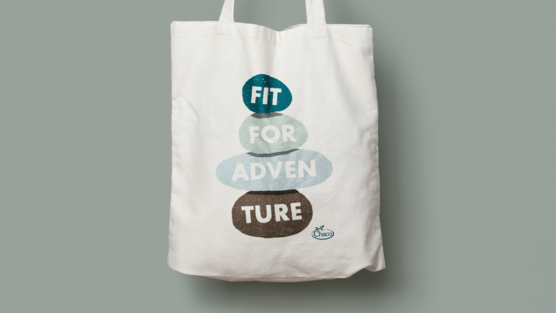
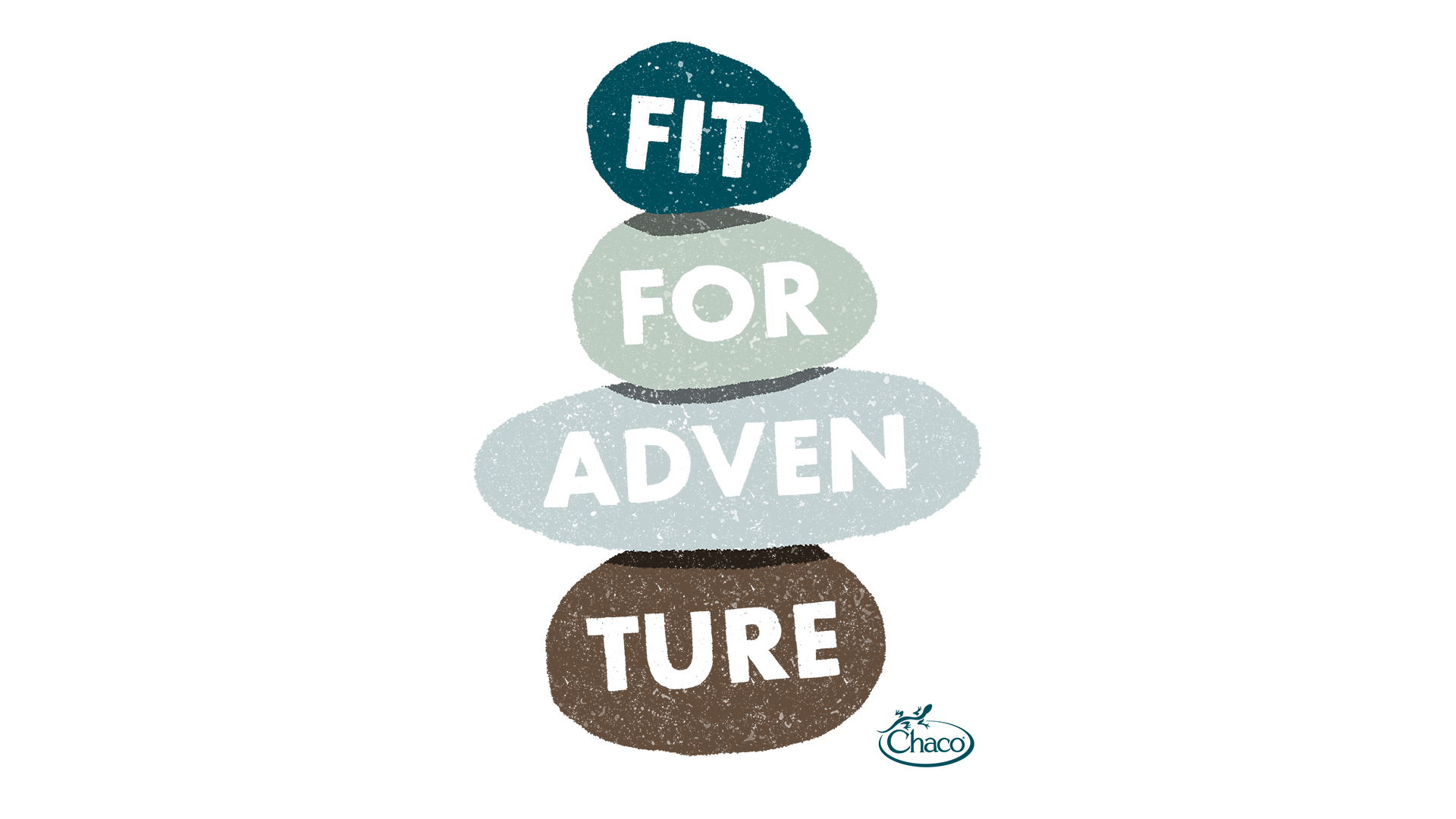

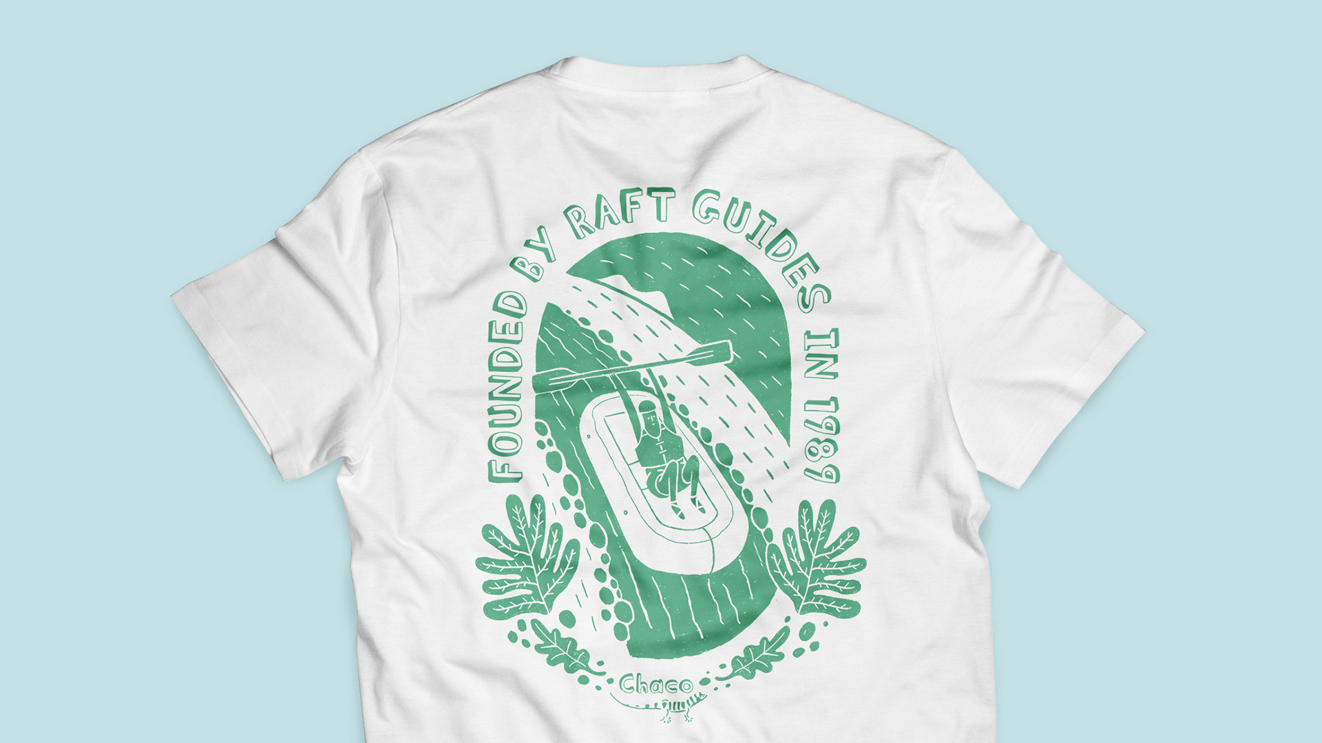

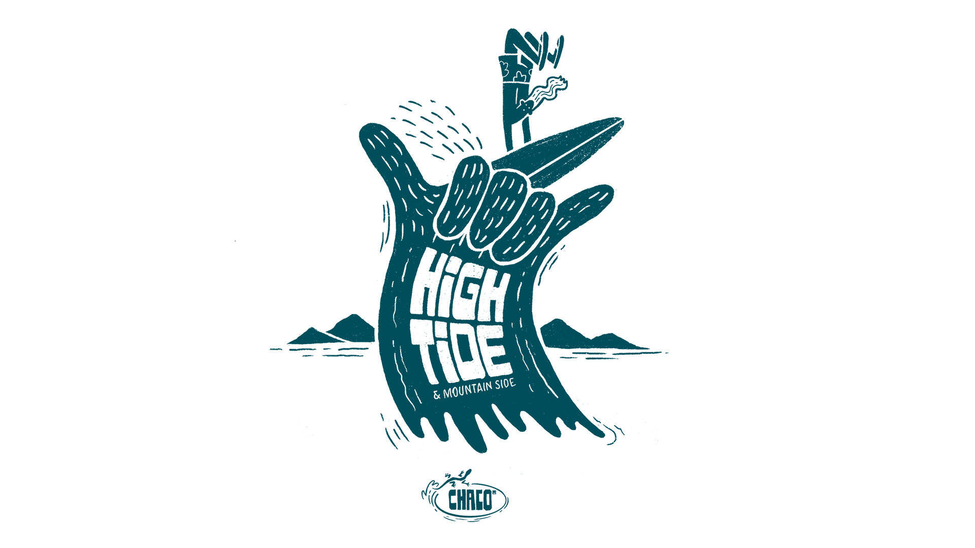
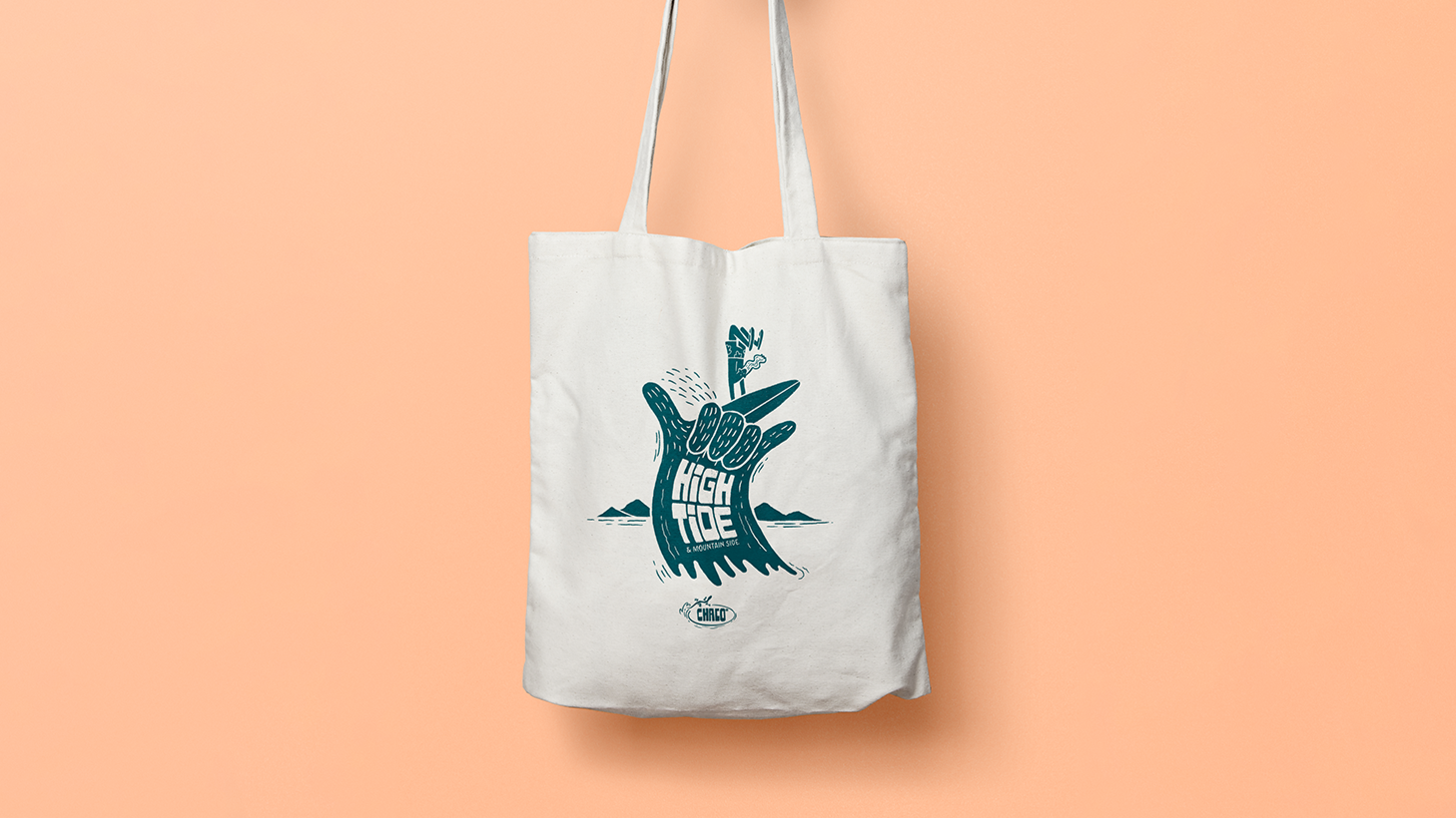
The born on the river adventure-ready footwear brand, was looking to develop a line of graphic/soft goods tactically focused on outdoor adjacent communities and specialty retail. Each design highlights one of the many taglines, footwear products, and emotional sentiments associated with the Chaco brand.
The illustration style I emulated, models after the work of Geoff Holstad—a big inspiration of the client’s, and for many of the graphics featured across the work. What felt like a shining moment for me during my time at Someoddpilot, lives on immortally through the form of stickers, totes, tees, and posters.
[ 005 ]
CHACO
Brand Identity
Graphic Art
Illustration
Surface Design

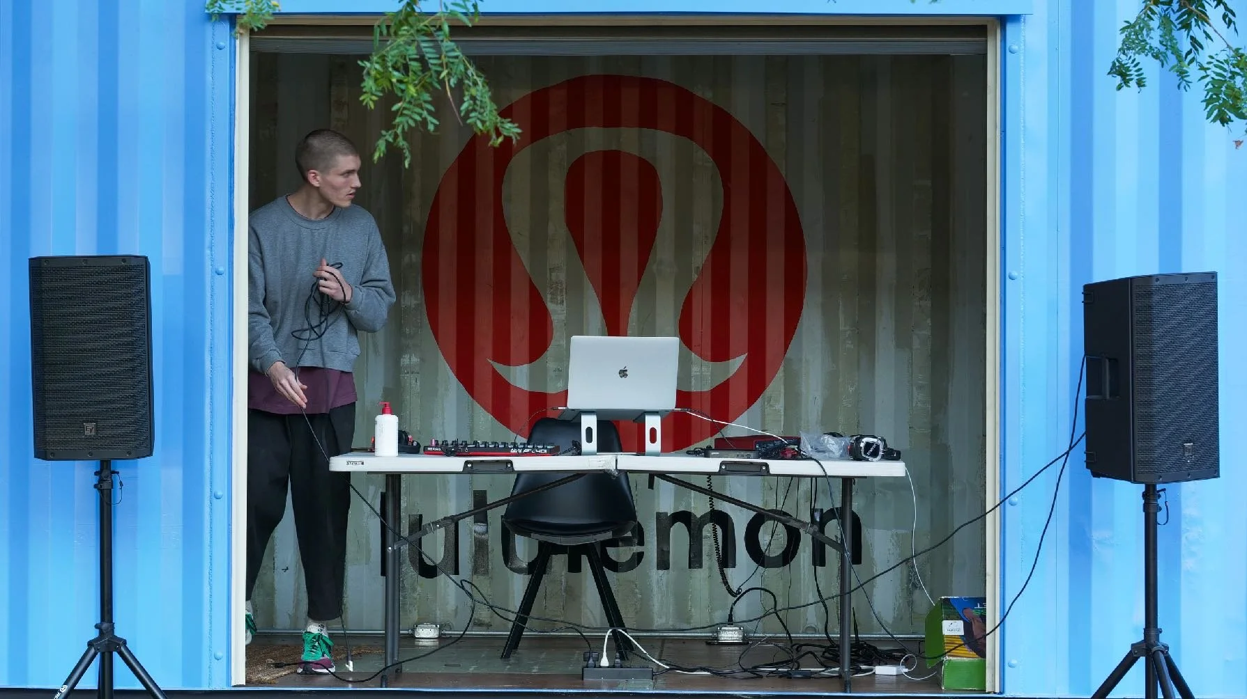
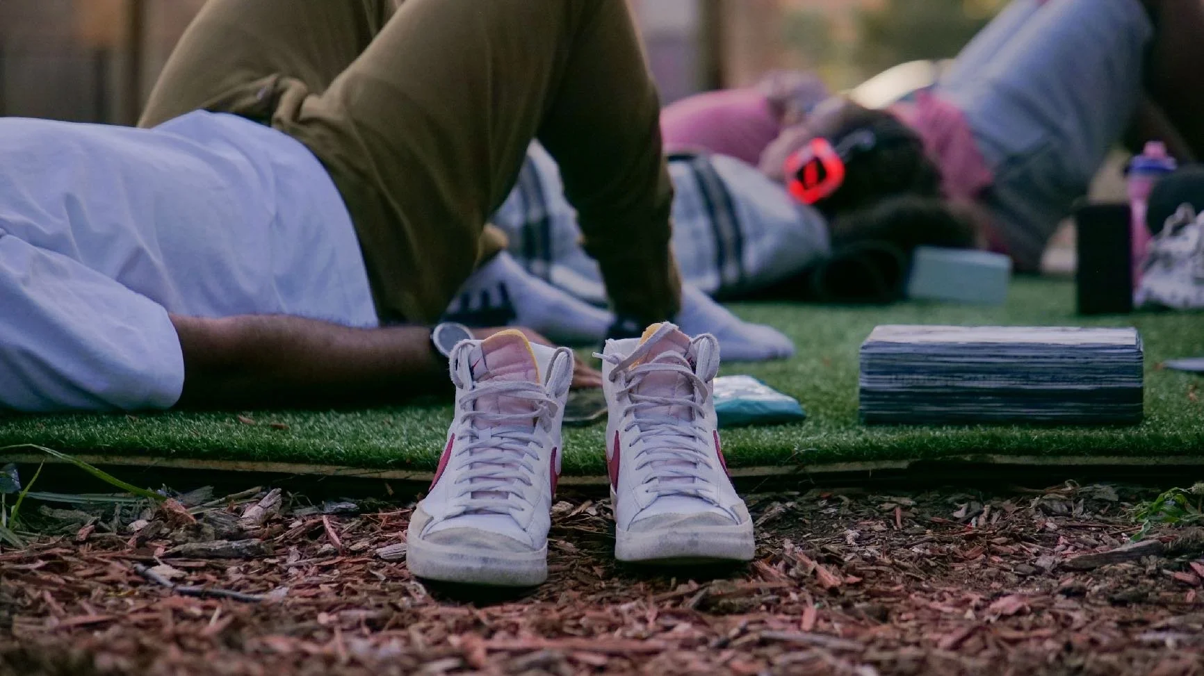
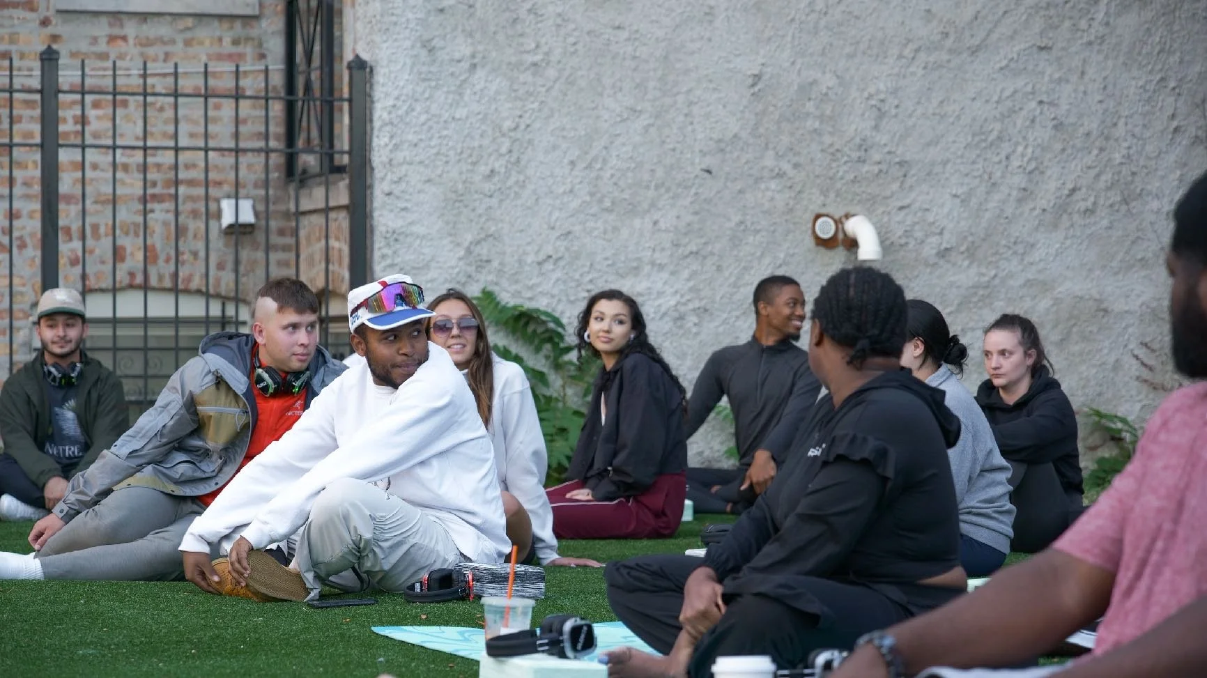

As part of Lululemon’s quarter-long activation to bring free fitness and wellness to the Southside of Chicago, Resound combined guided meditation with a custom soundscape via noise-canceling headphones. Good friend and community lead Karla Huffman—reached out hoping to put heads together around finding a face and name for the event.
It was said that the meditation would “focus on releasing, welcoming in the fall, and calling in what we wanted as we transitioned into a new season”. The flyer design I arrived at uses portraiture to depict the more literal sense of the experience, while using color and layout to articulate the abstract.
[ 006 ]
LULULEMON
eFlyer
Graphic Design
Layout Design
Photography
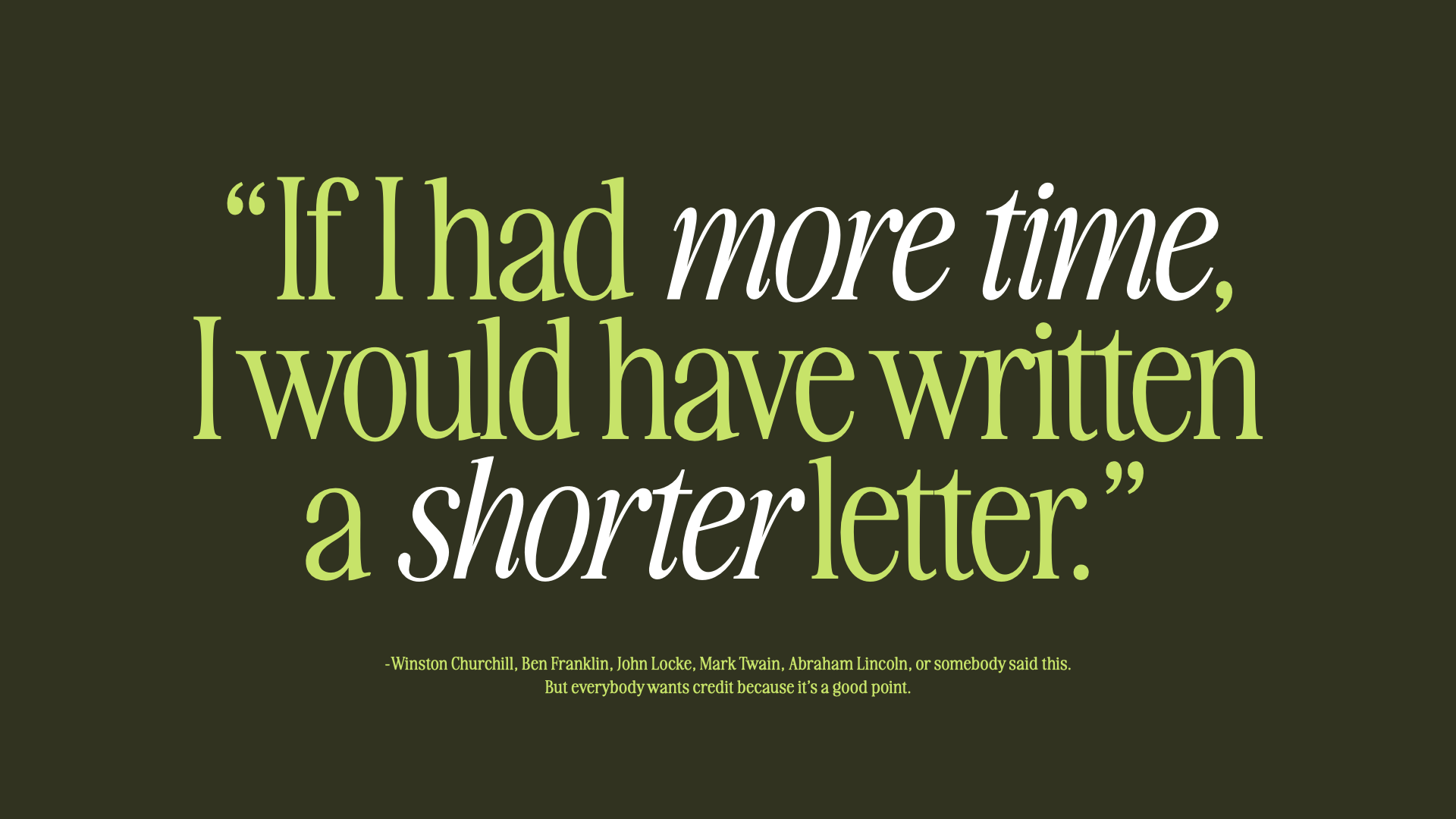
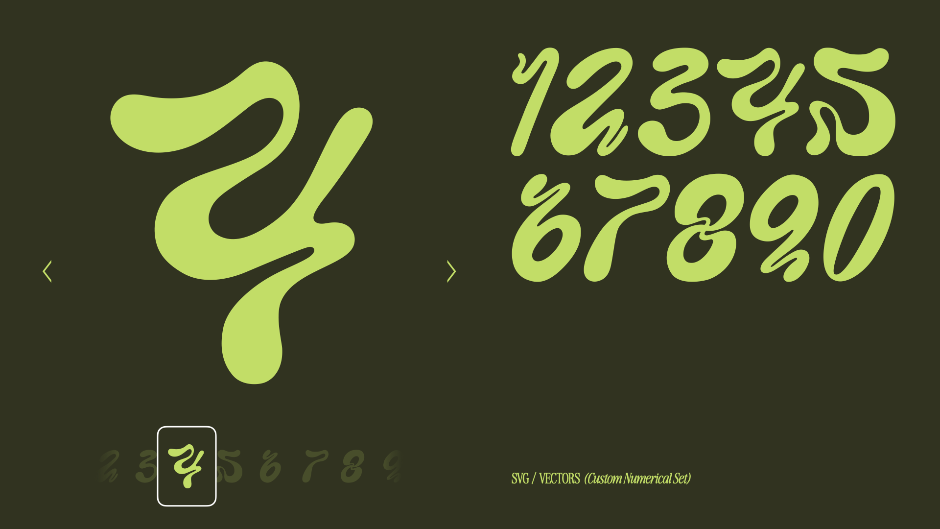
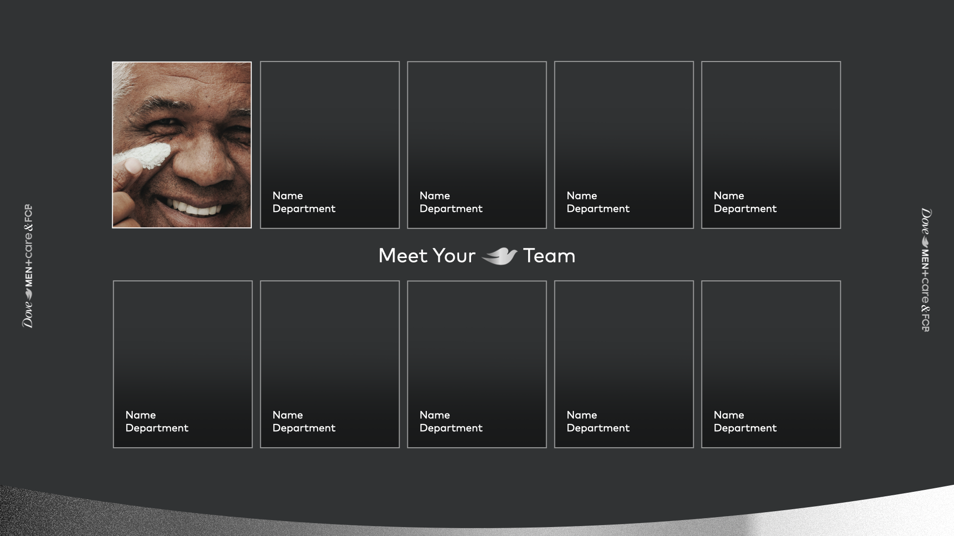
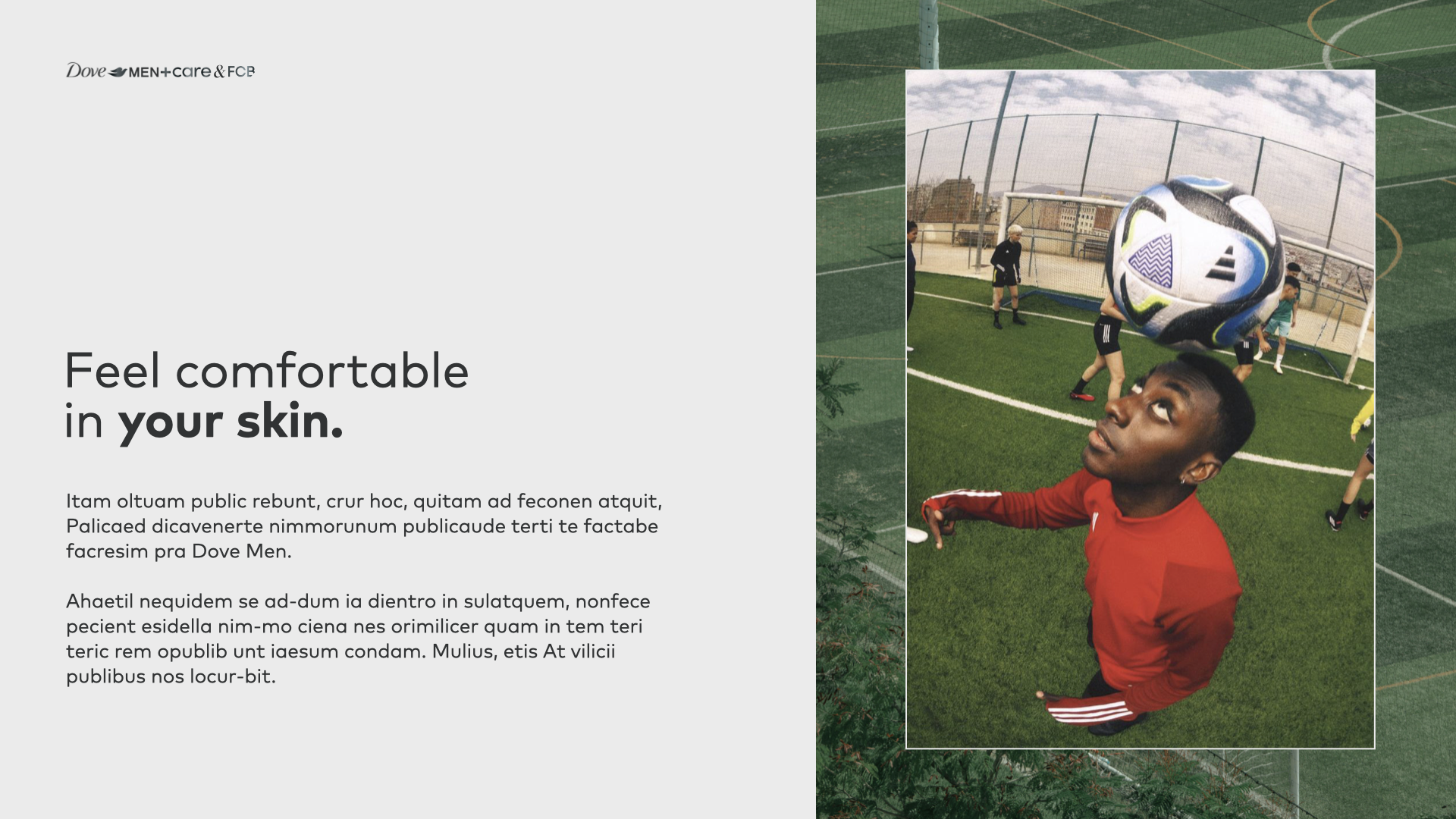
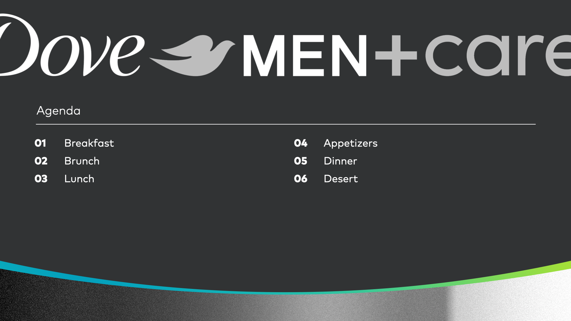
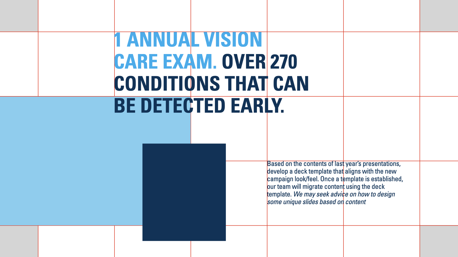
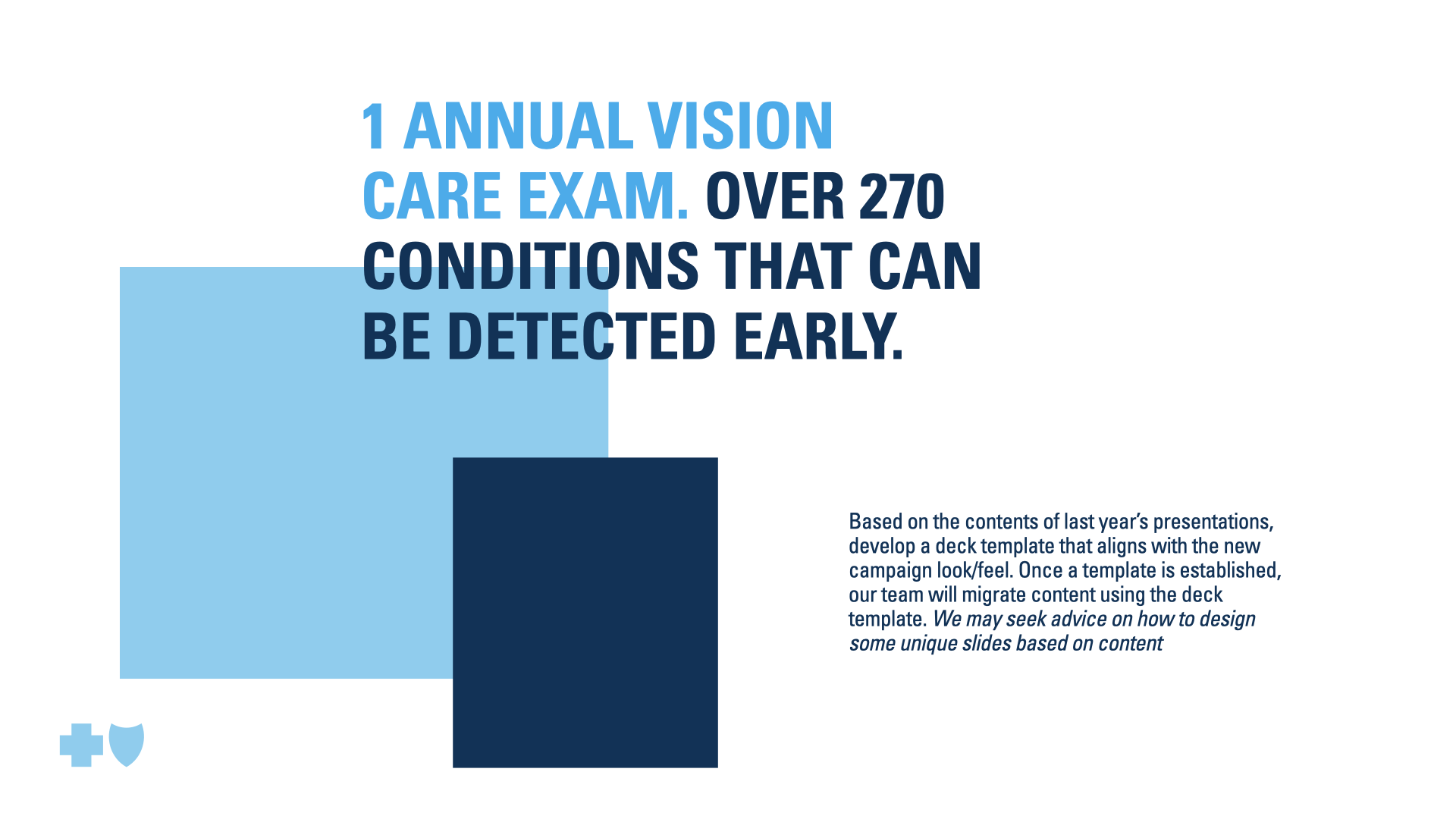
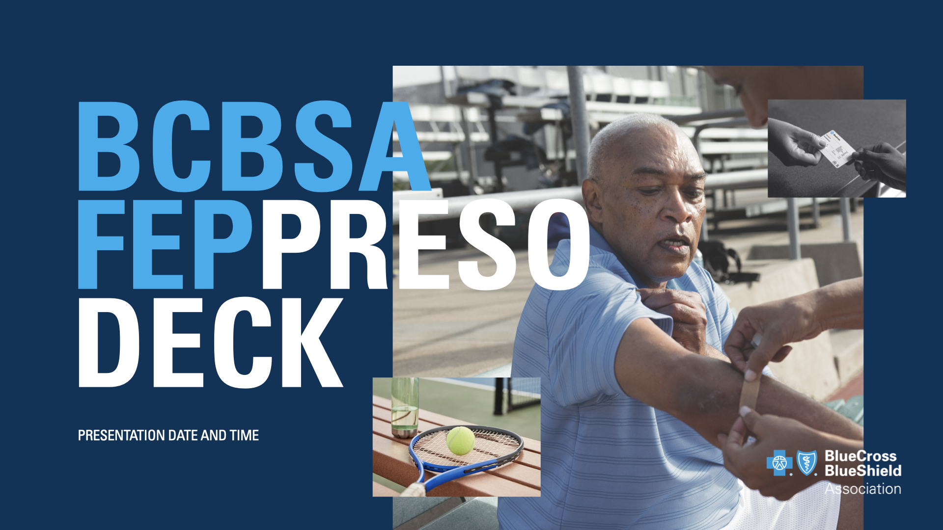
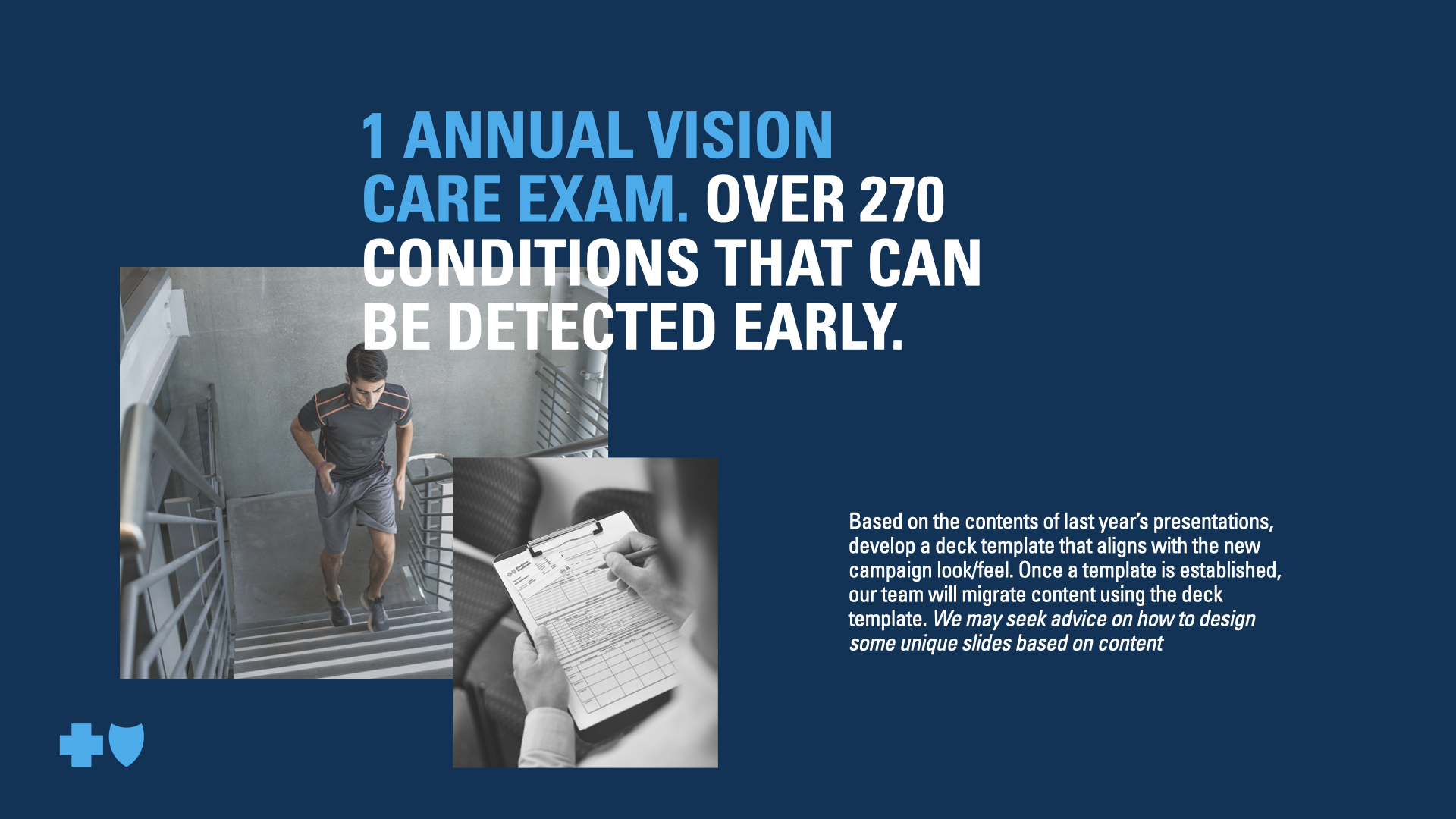
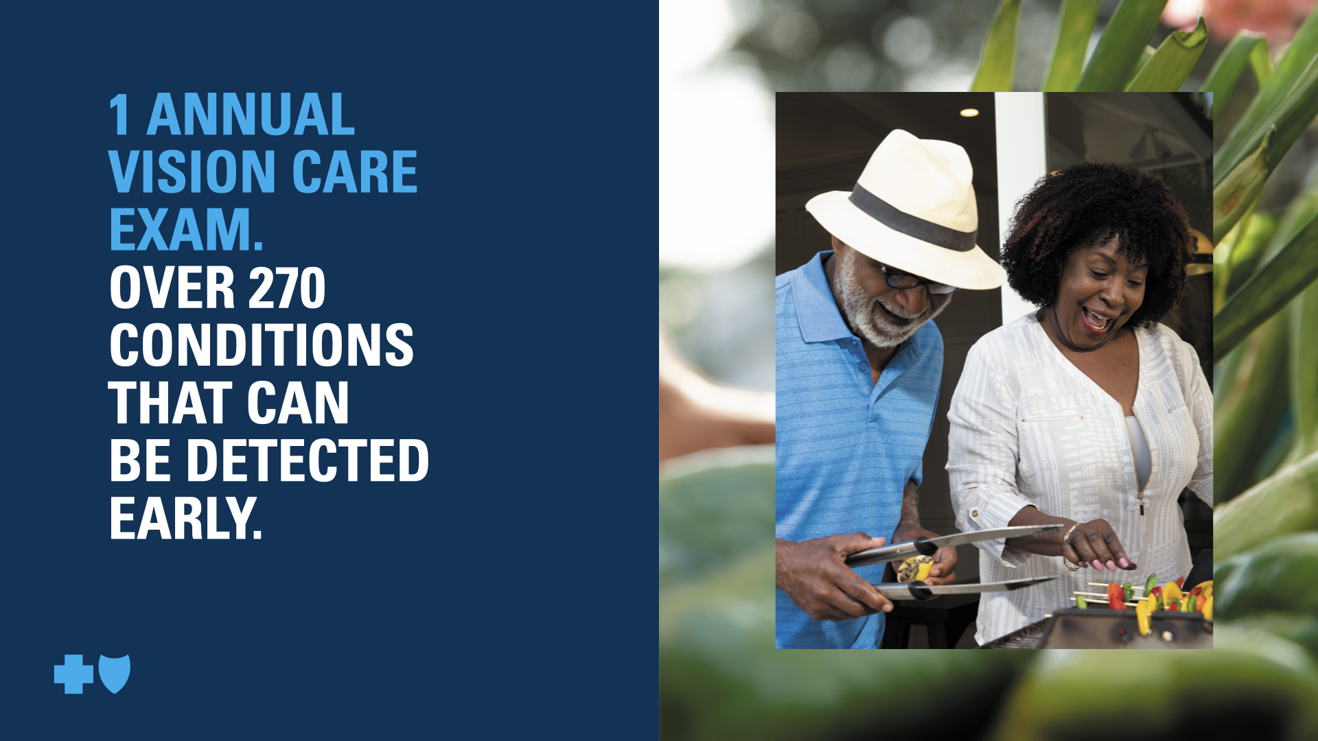
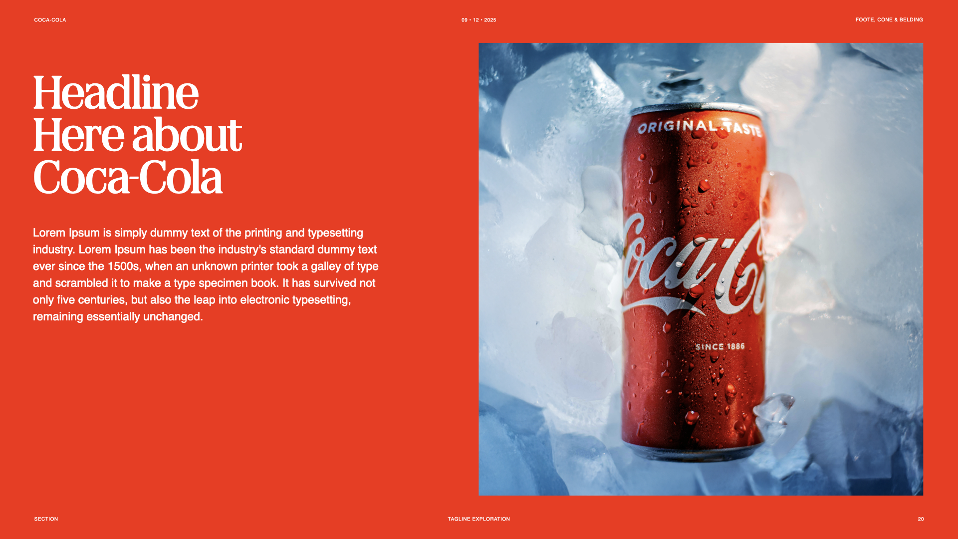
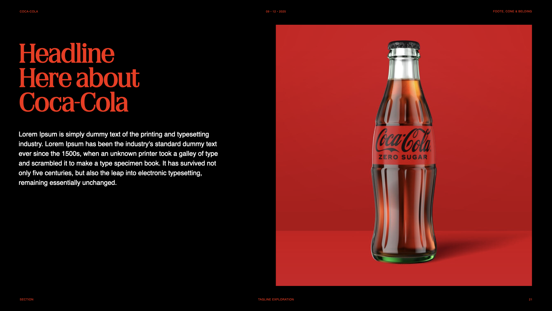
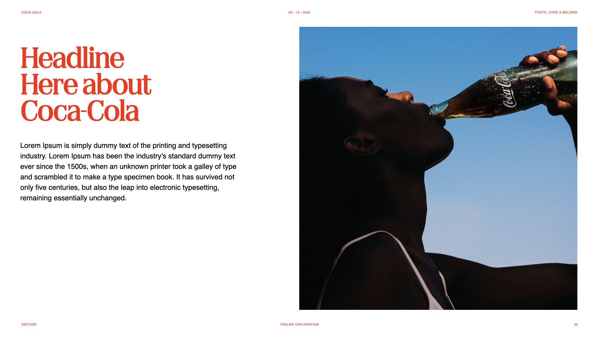
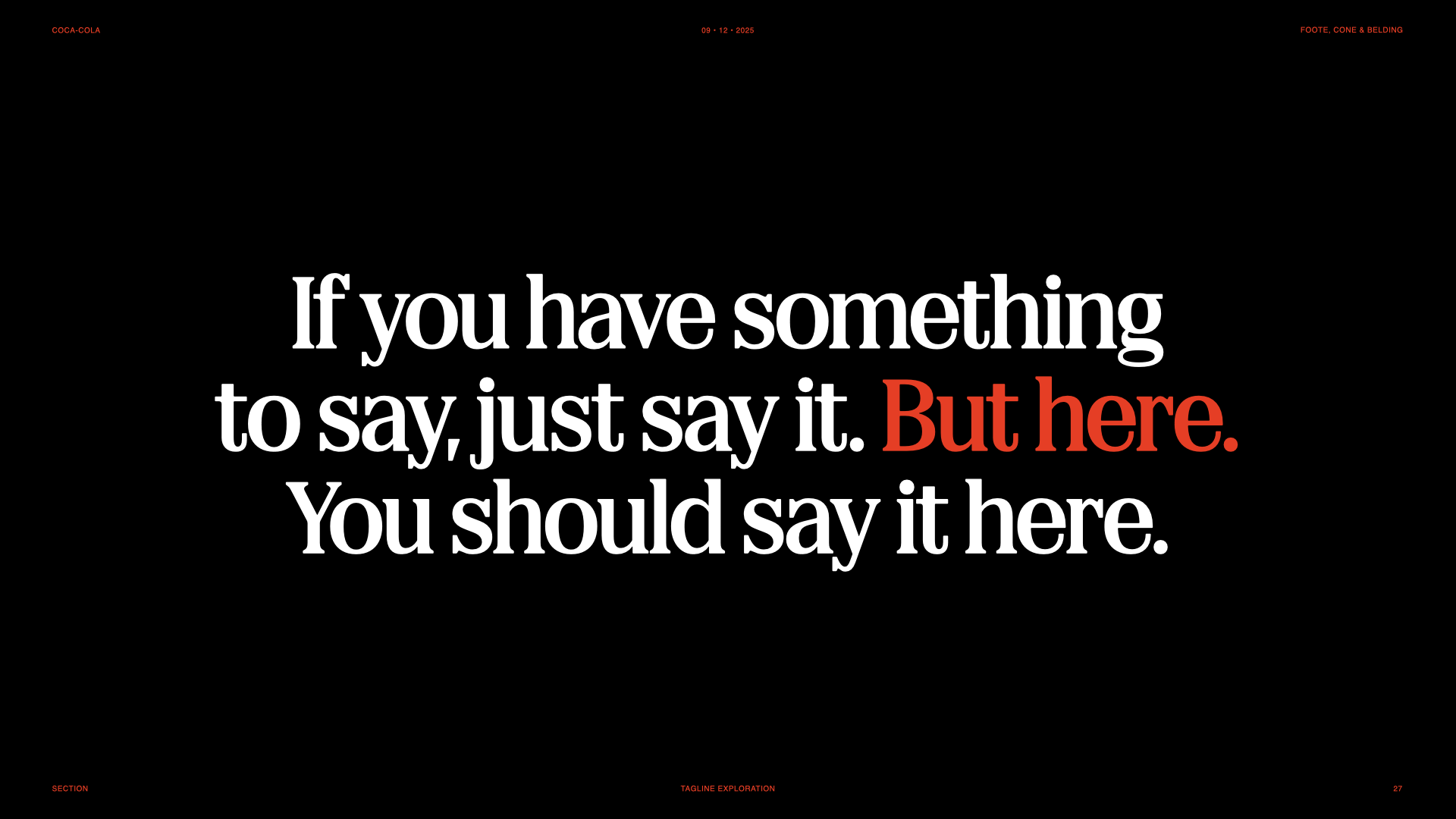
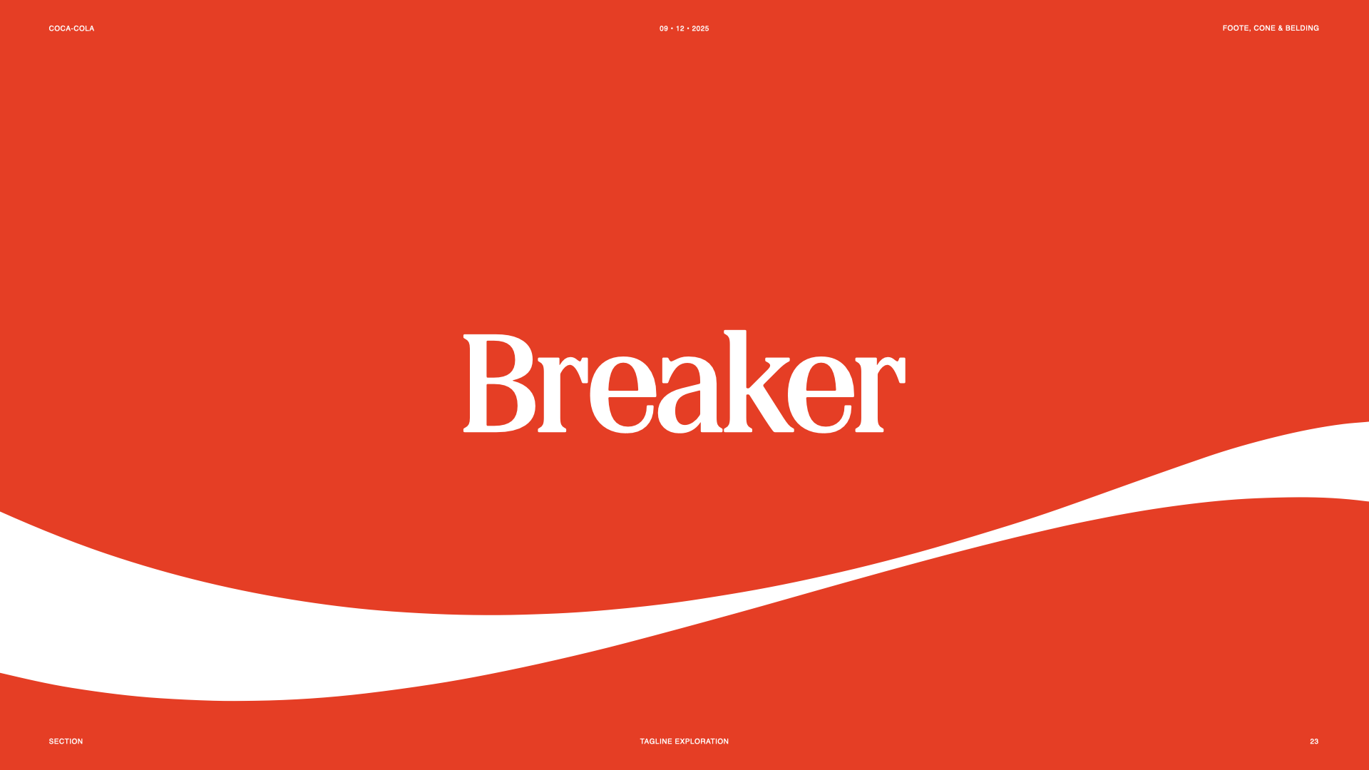
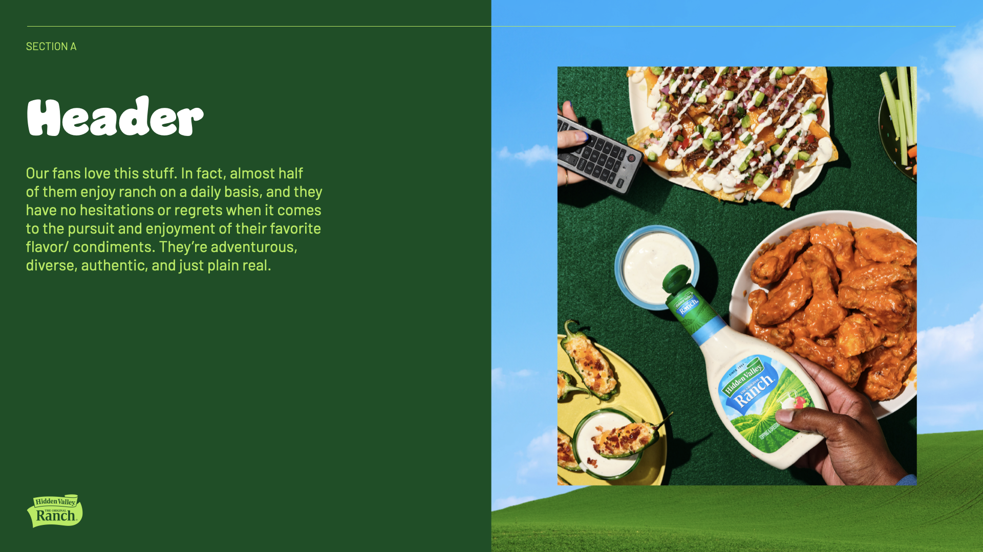
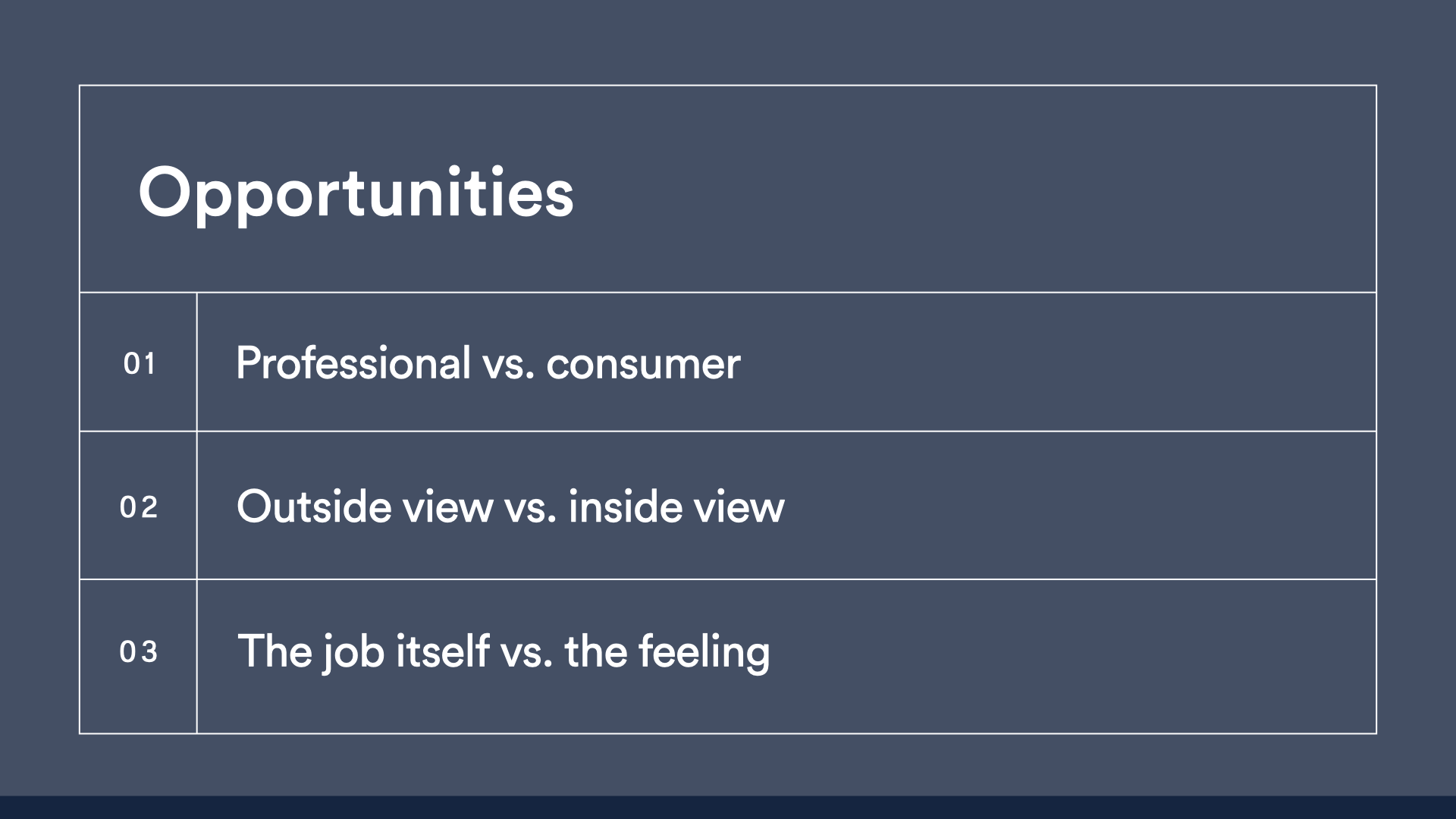
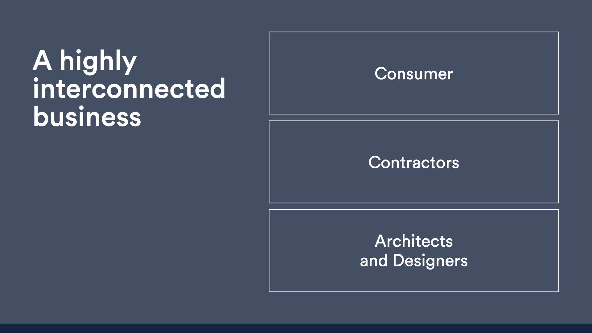
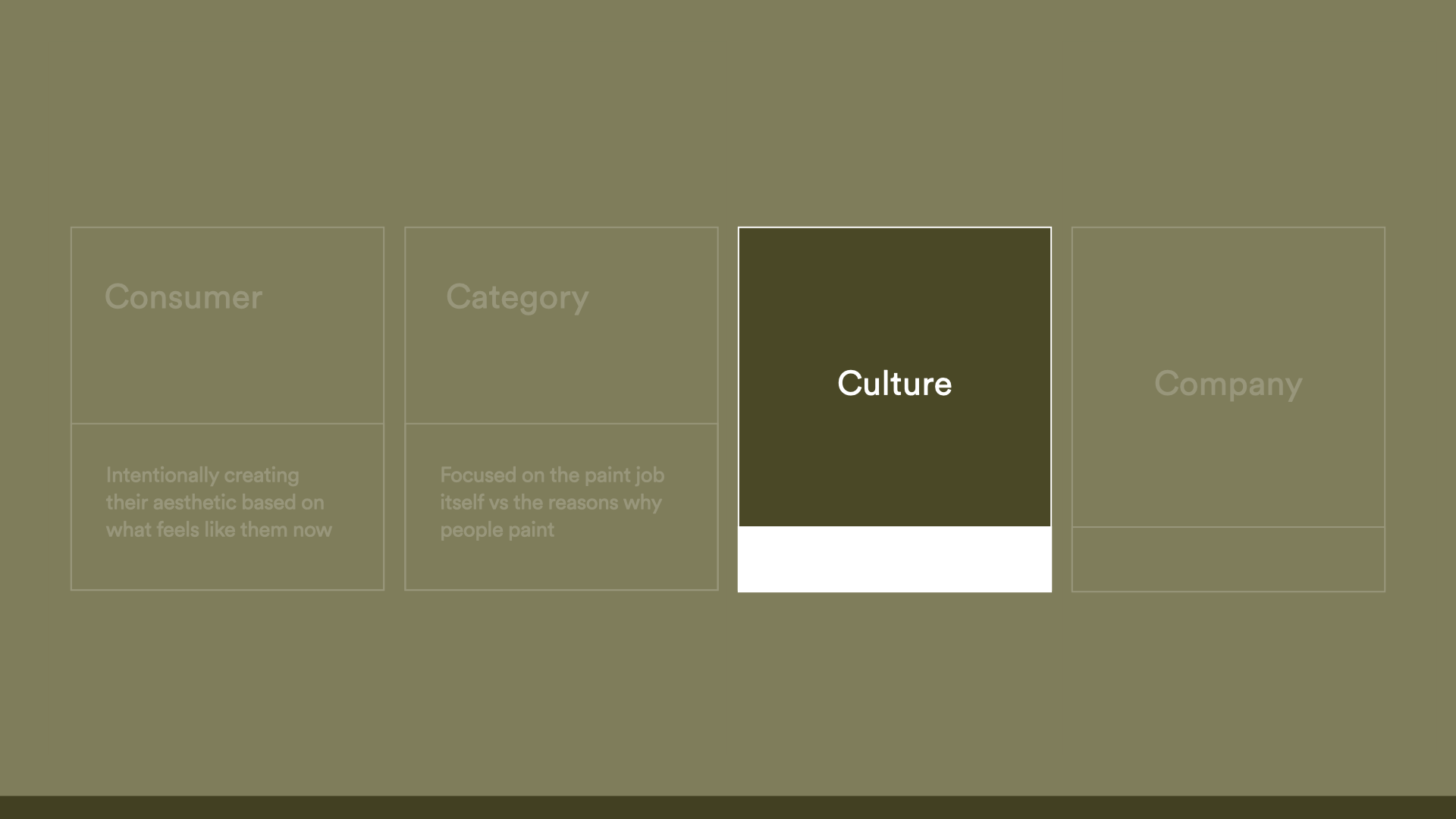
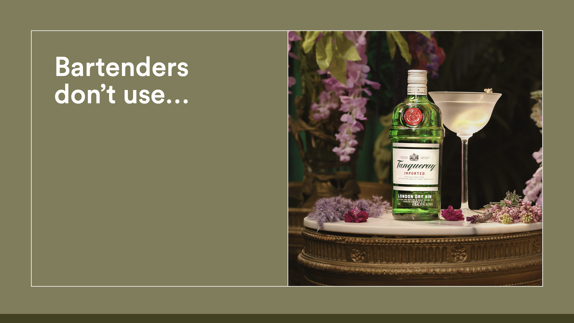
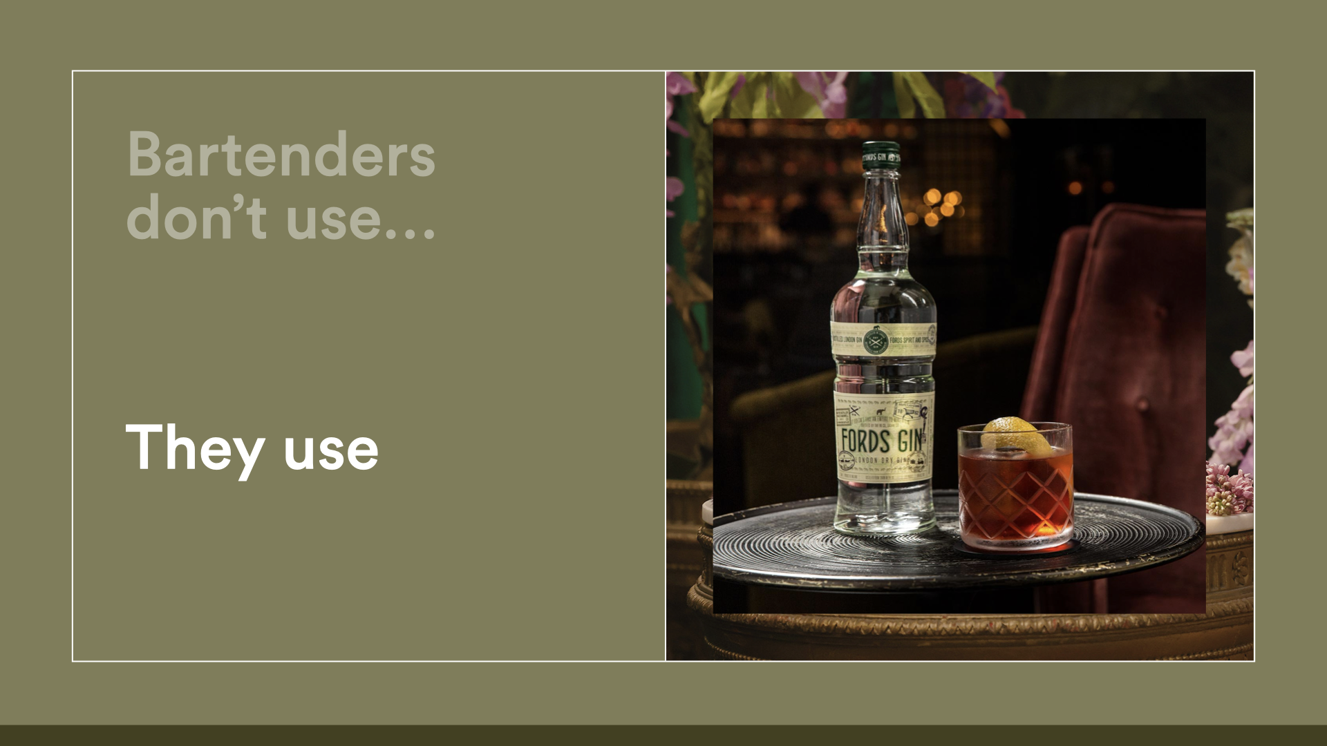
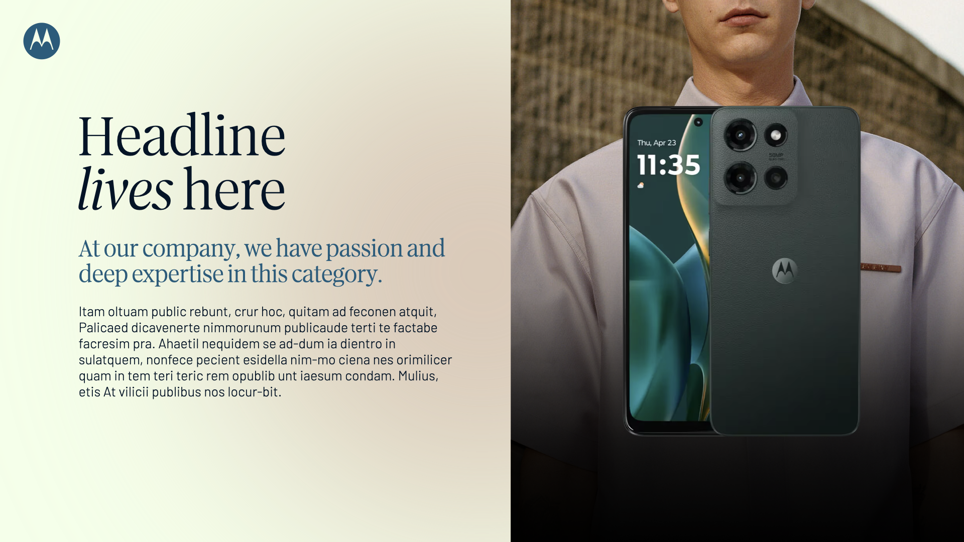
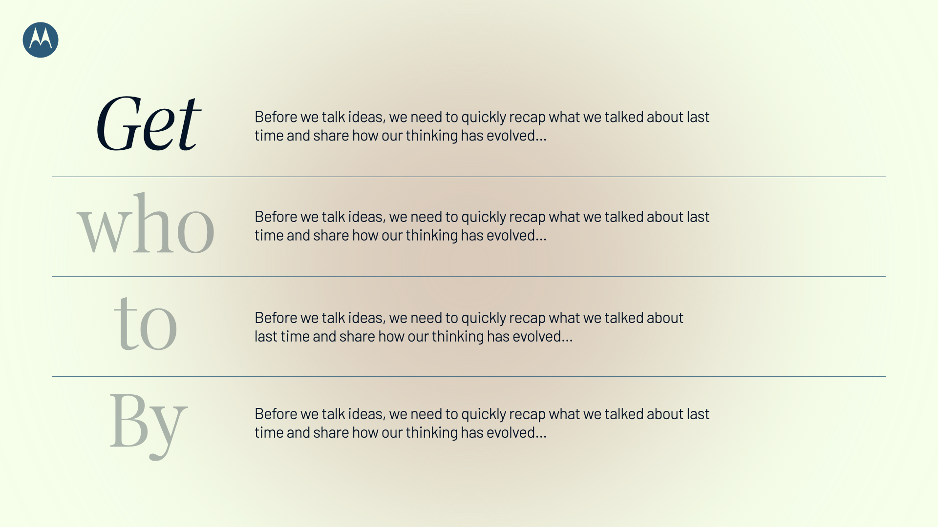
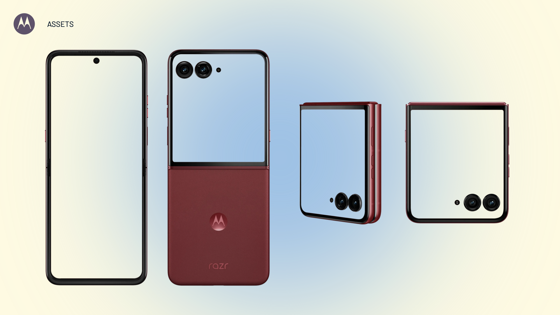
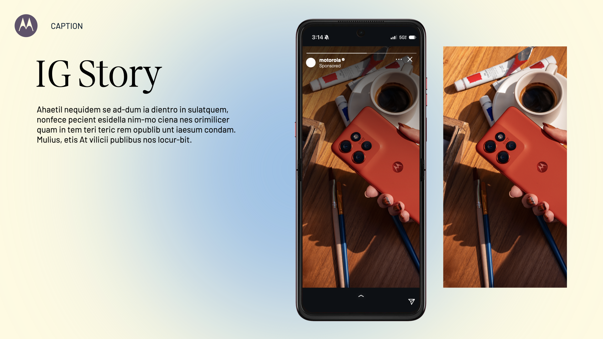
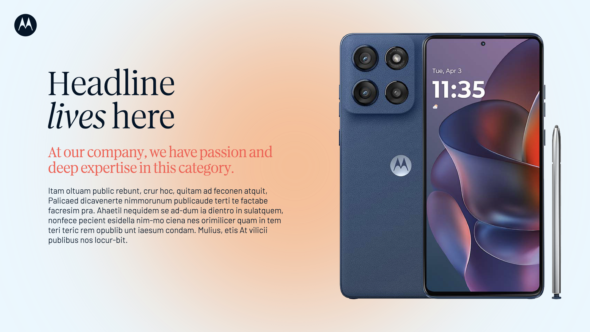
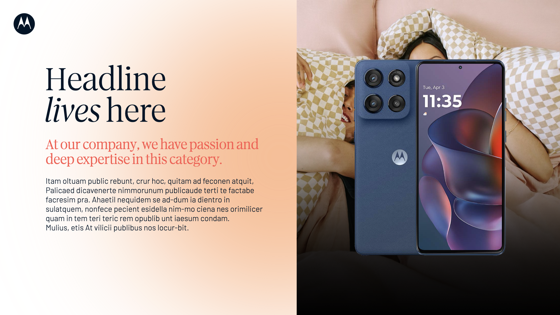
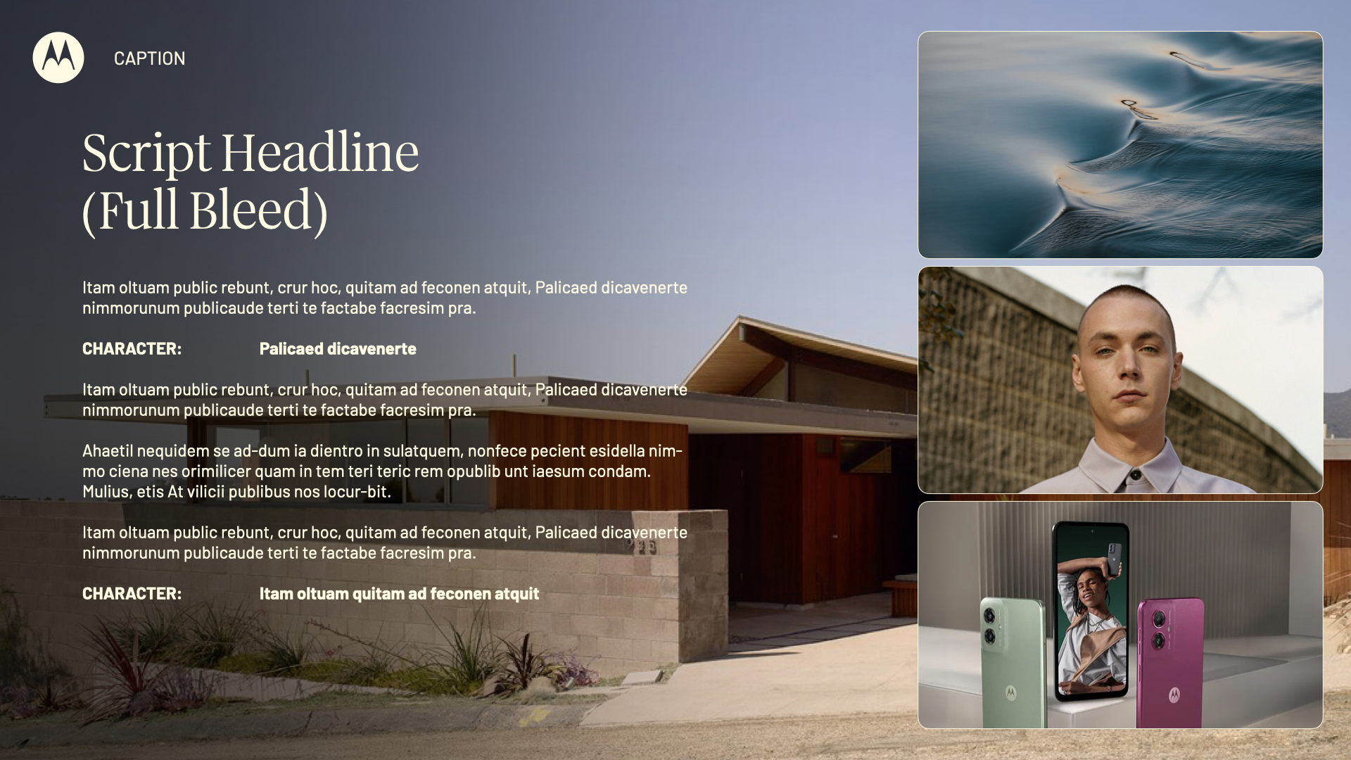
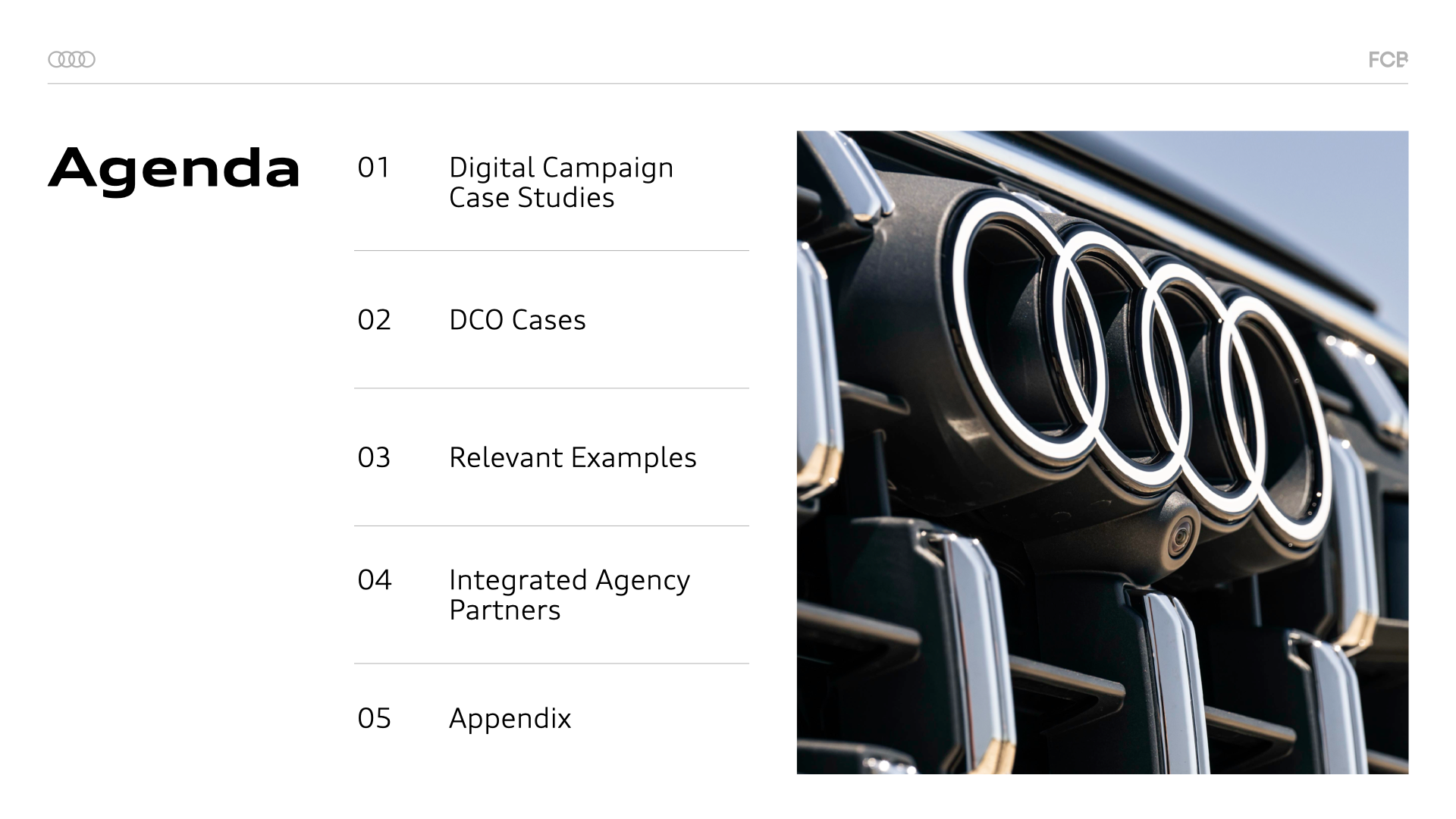
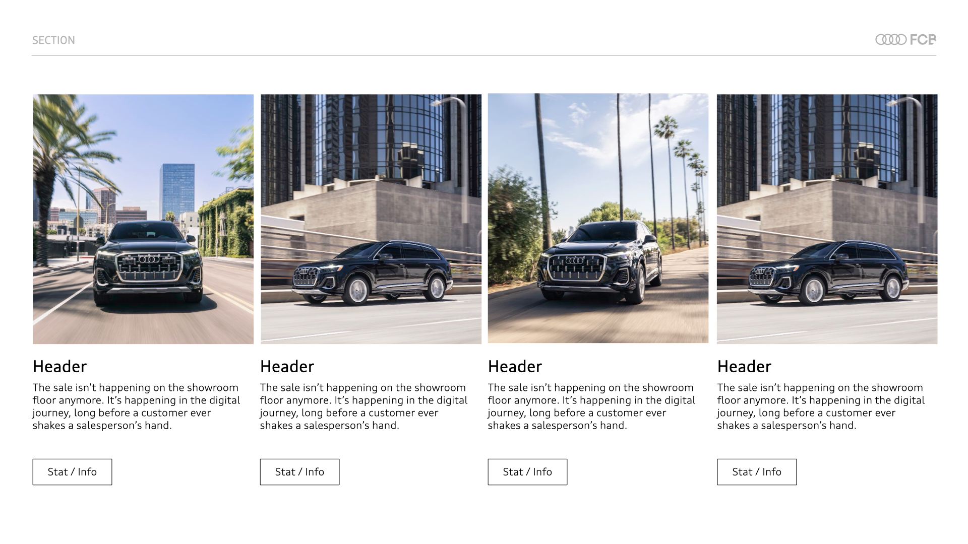
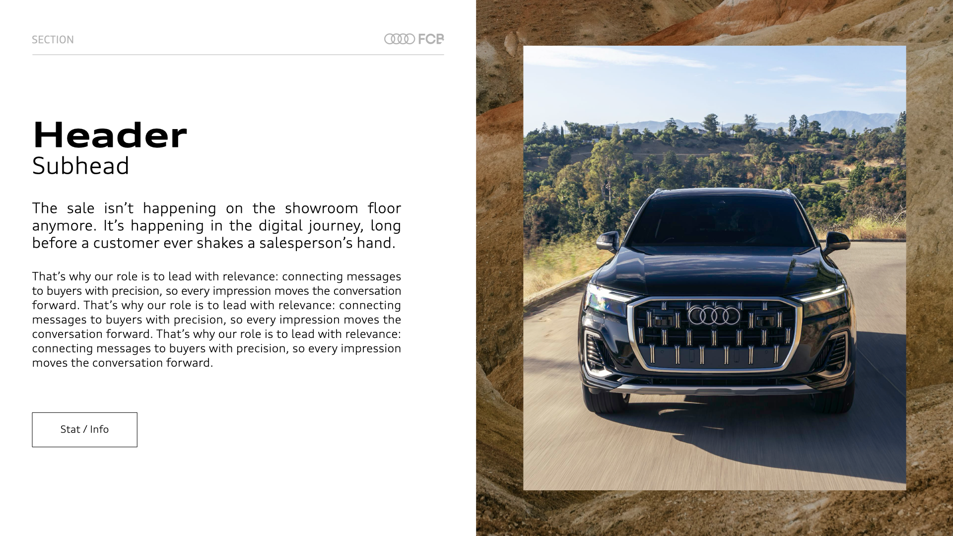
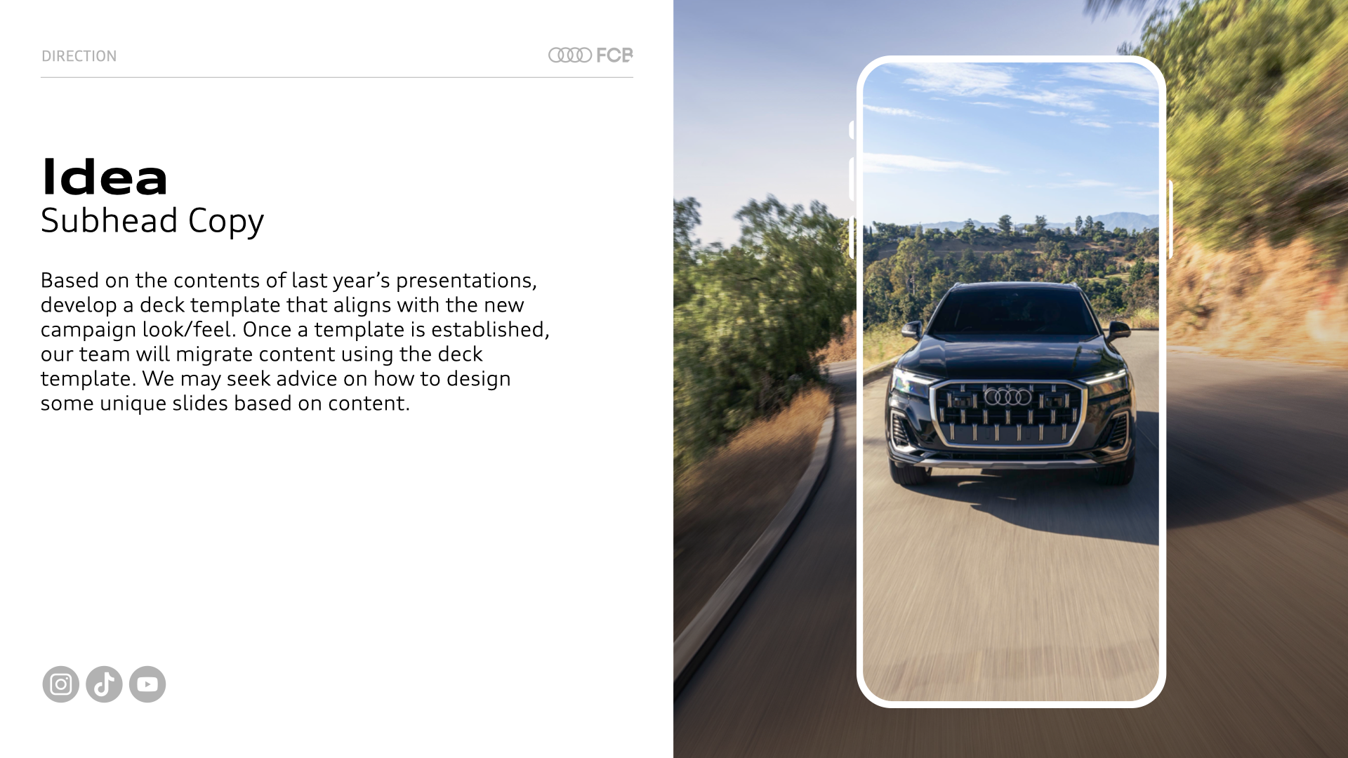
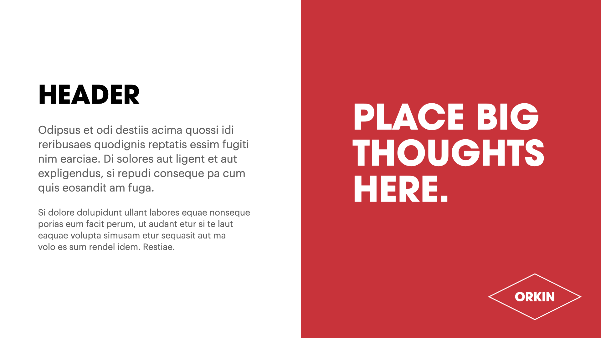
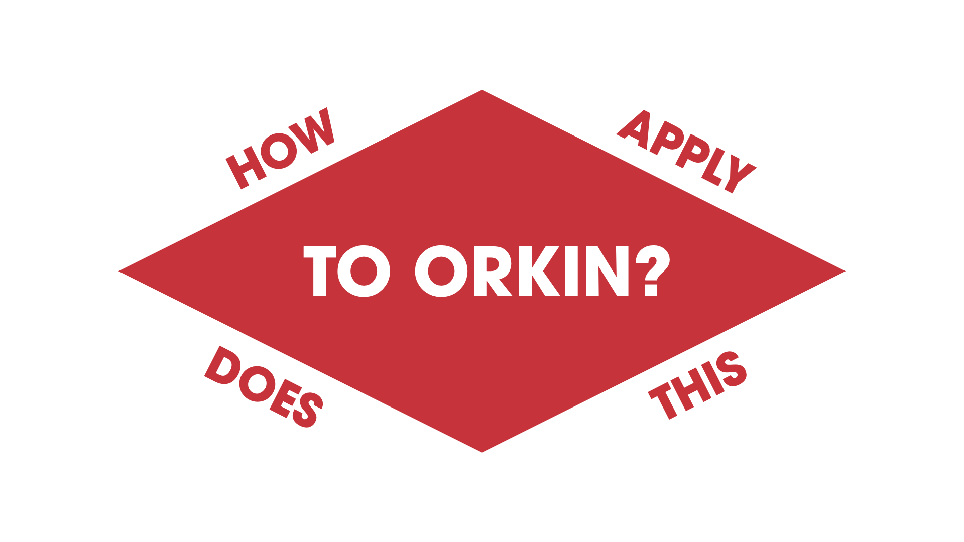
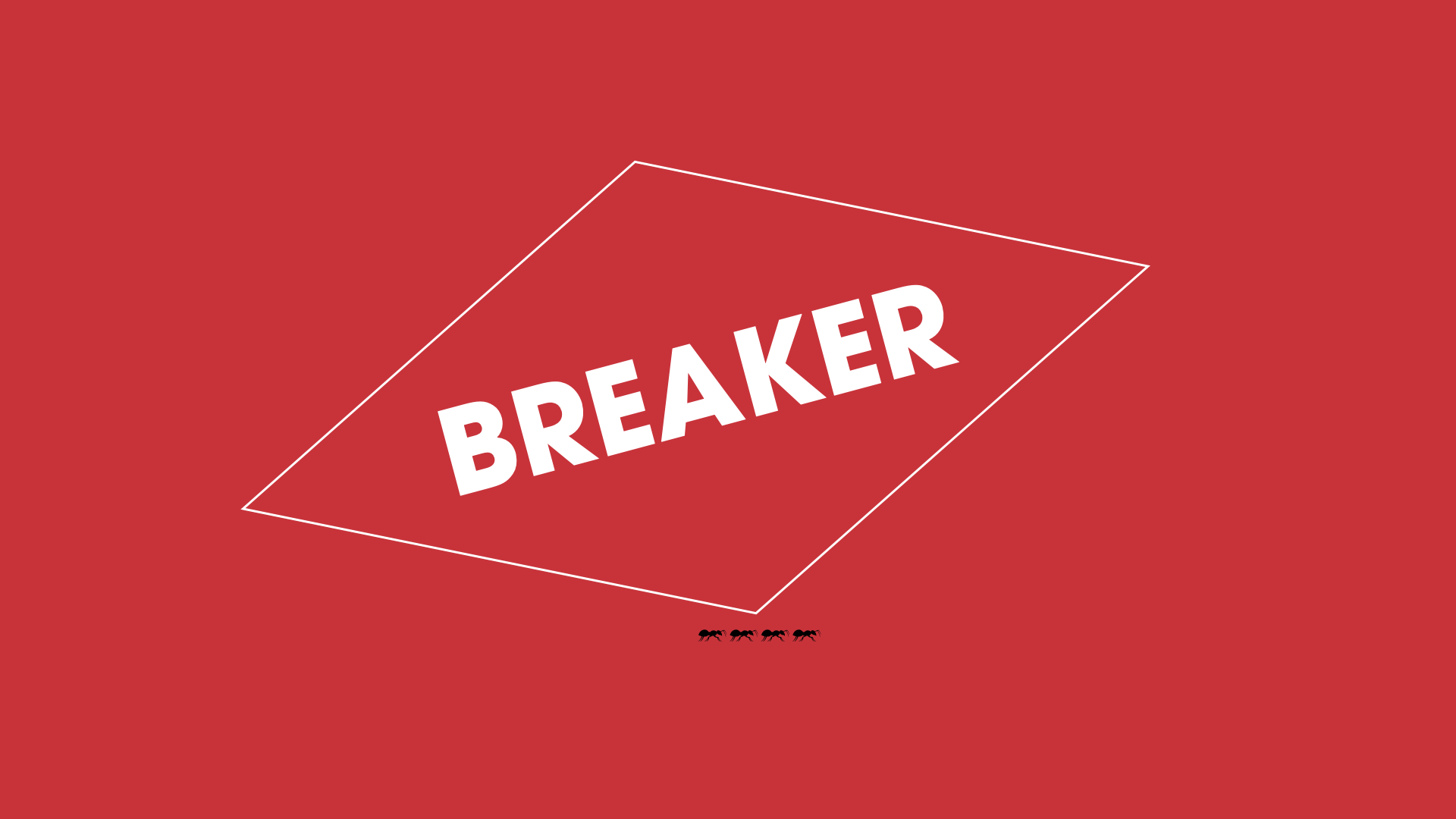
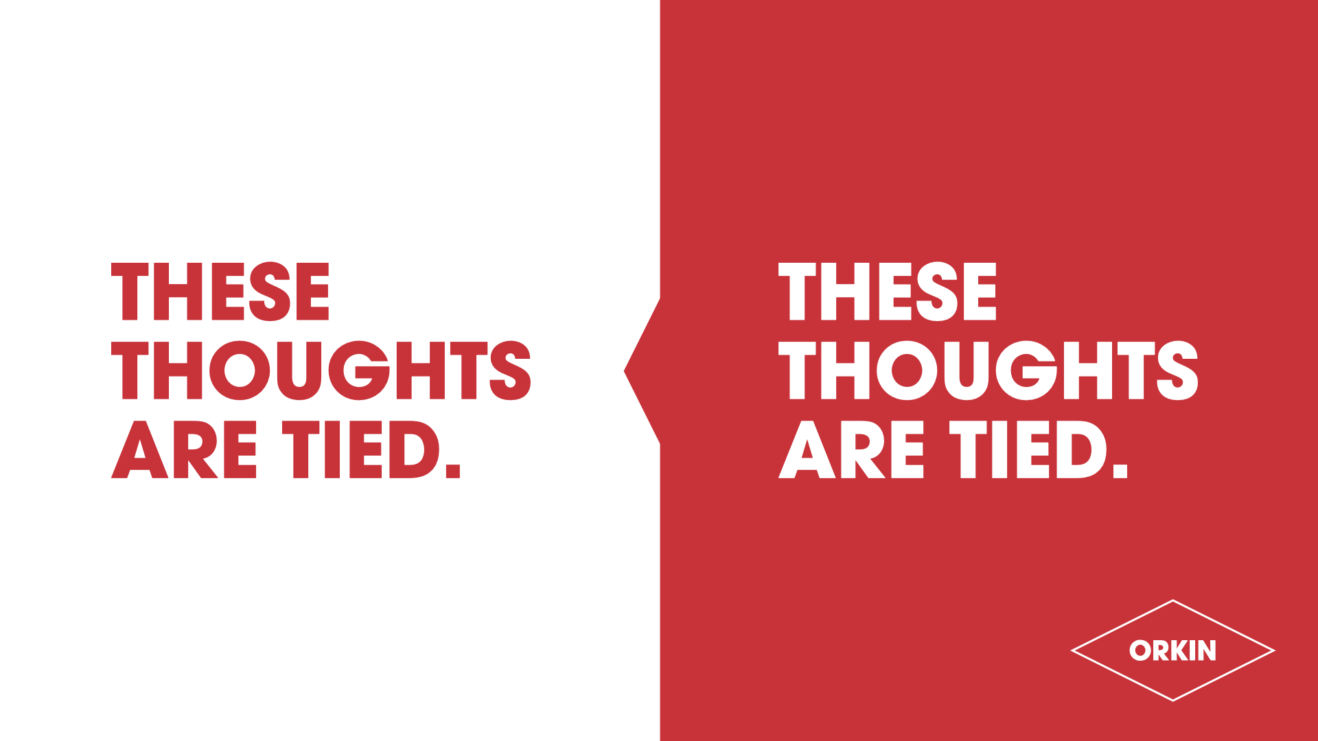
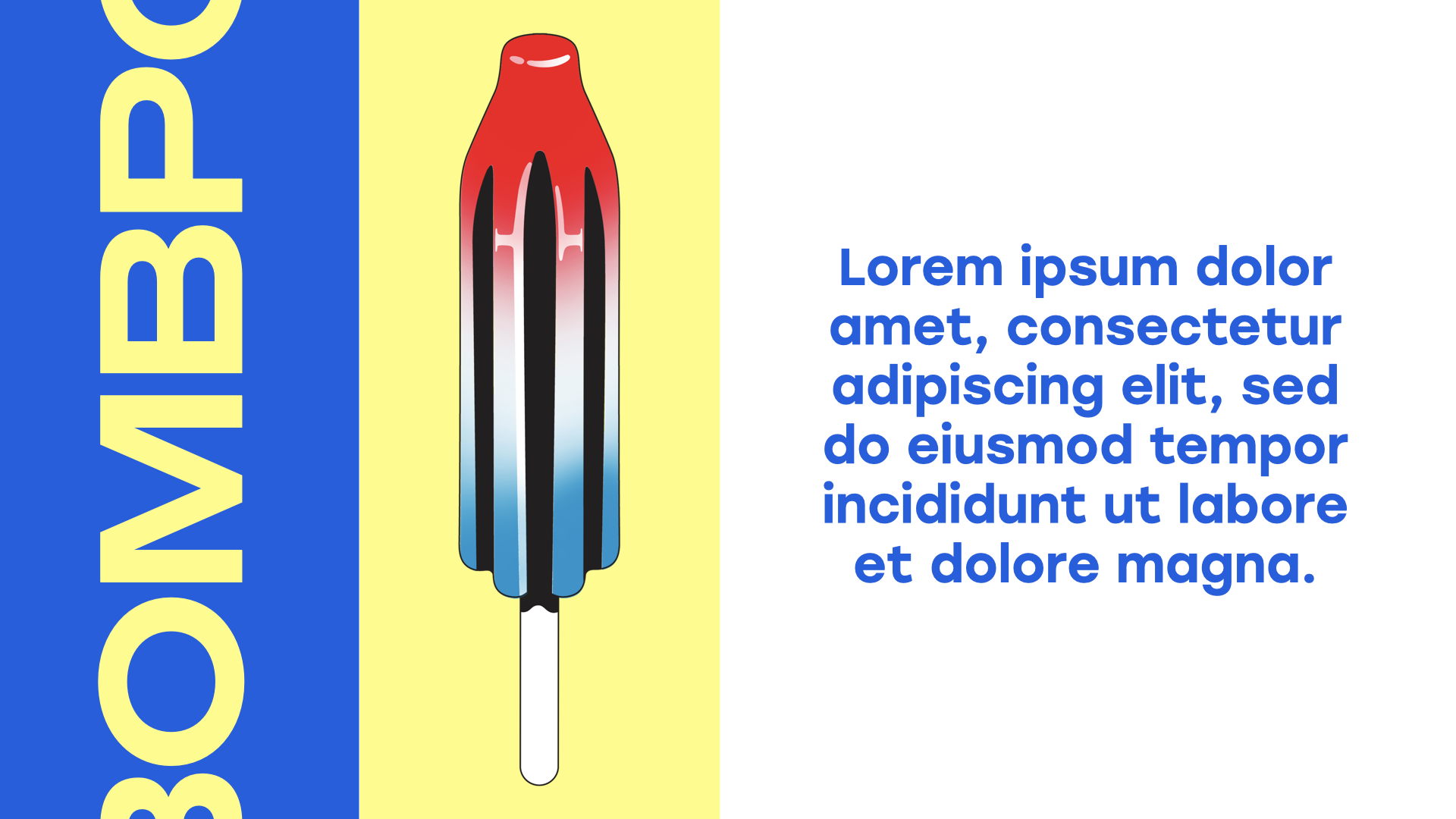
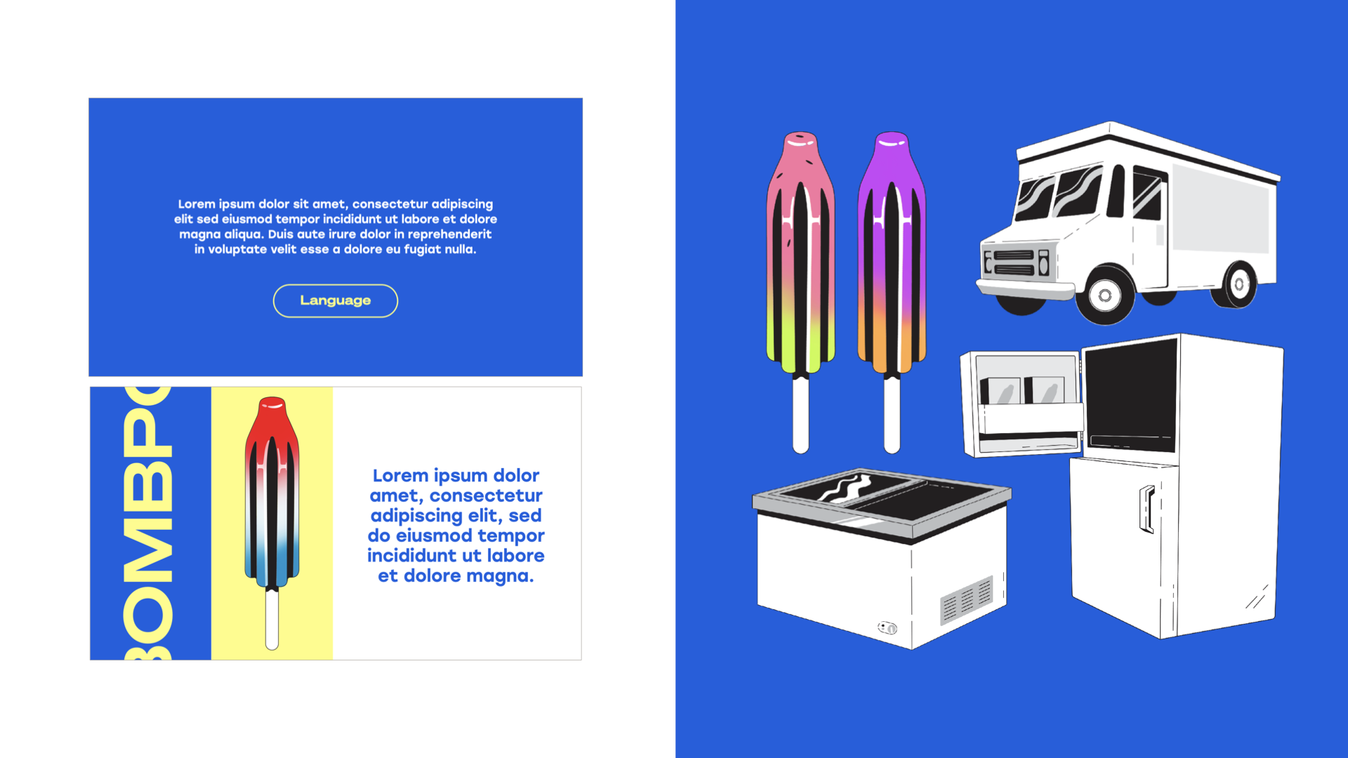
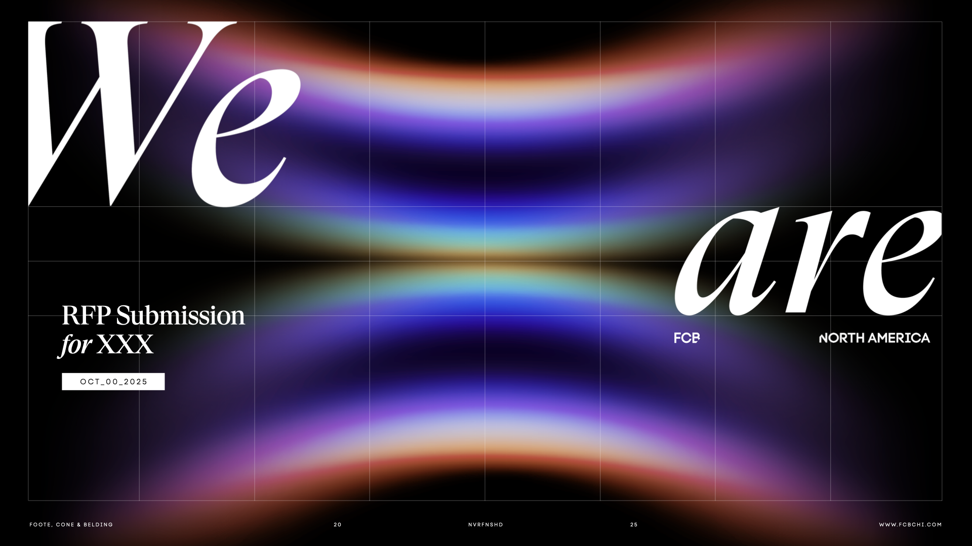
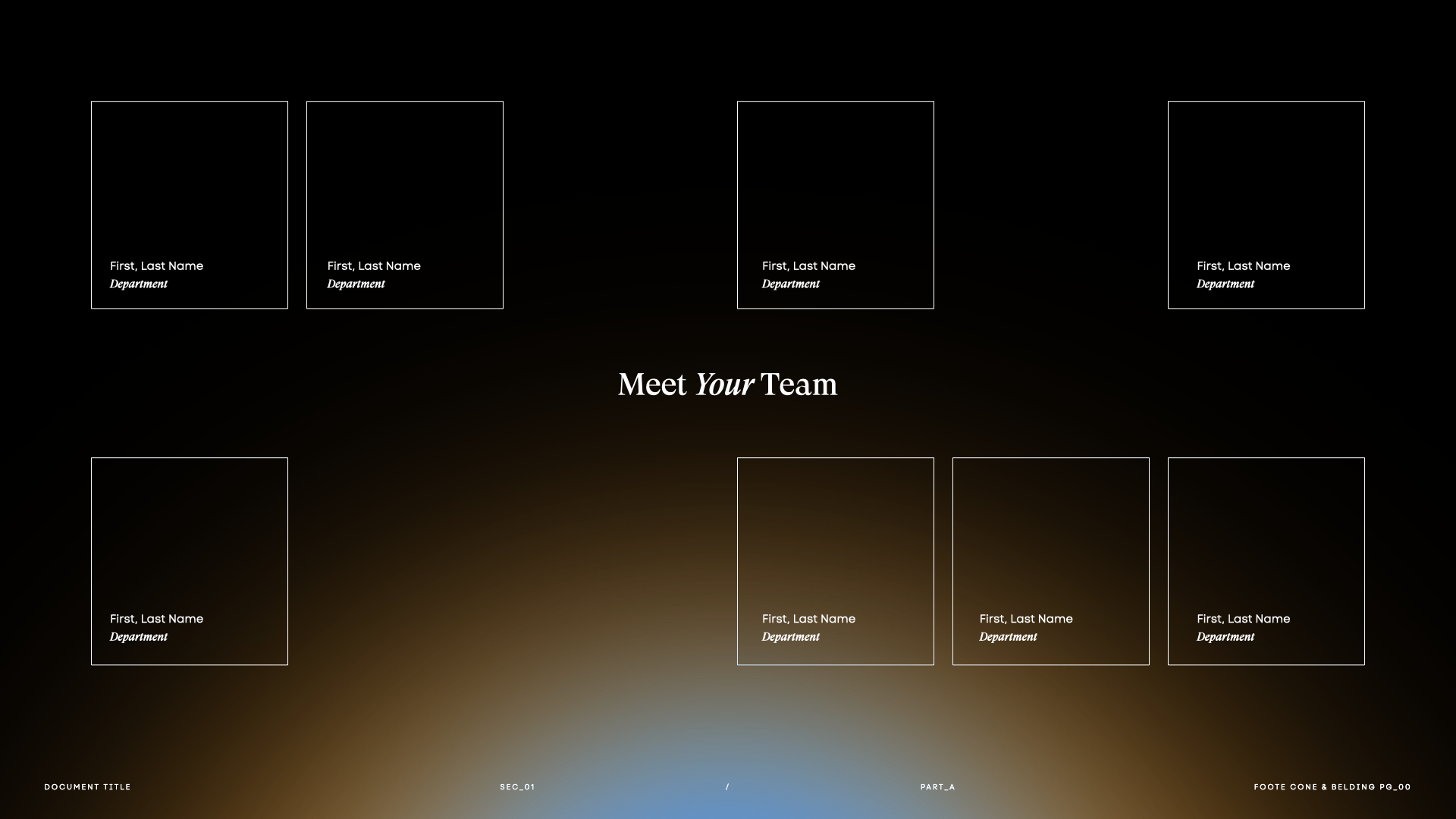
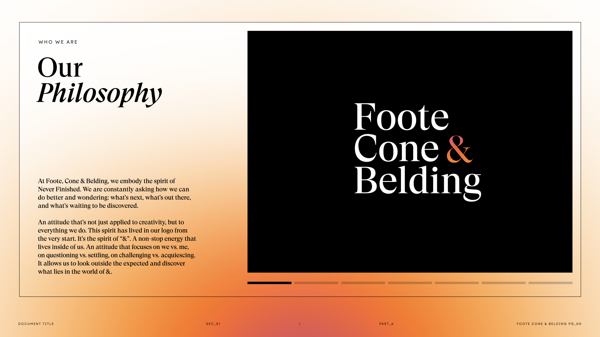
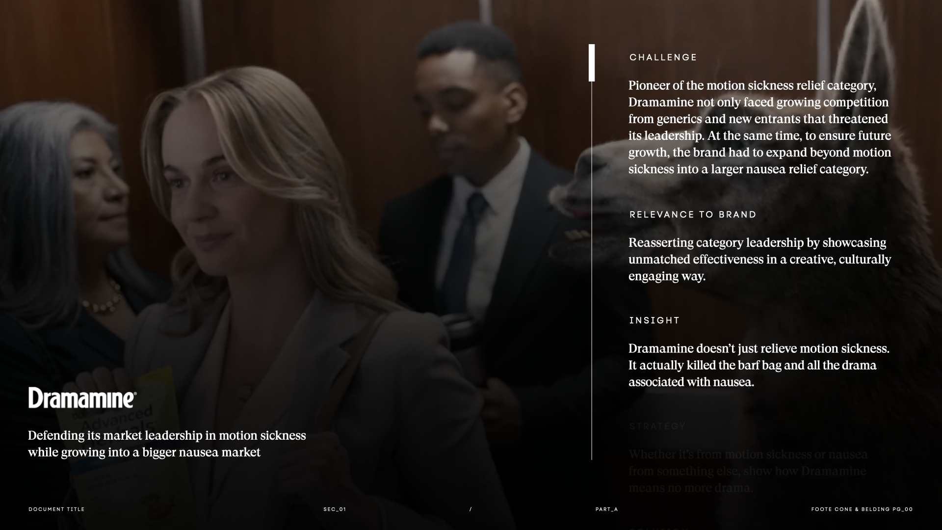
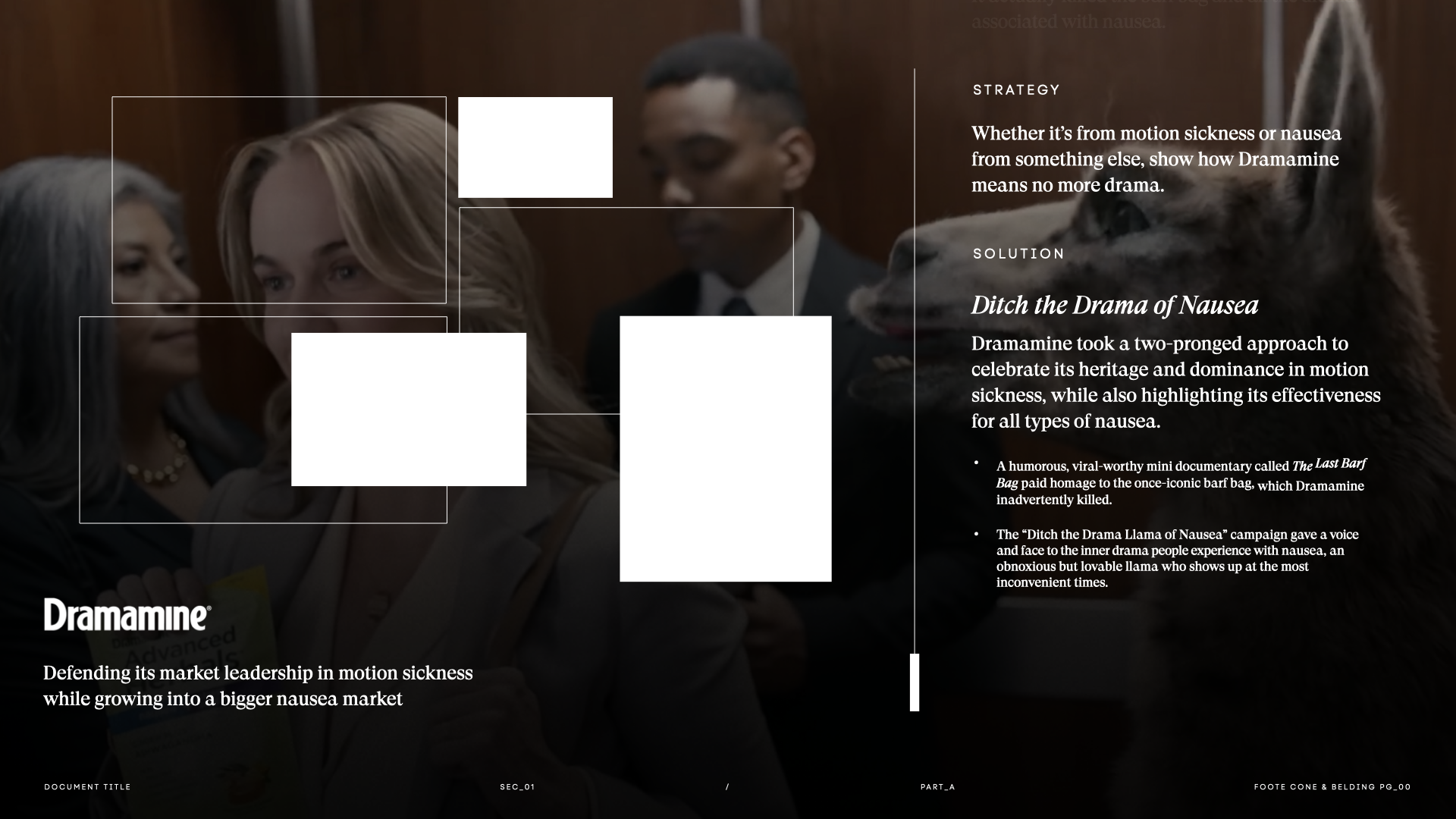
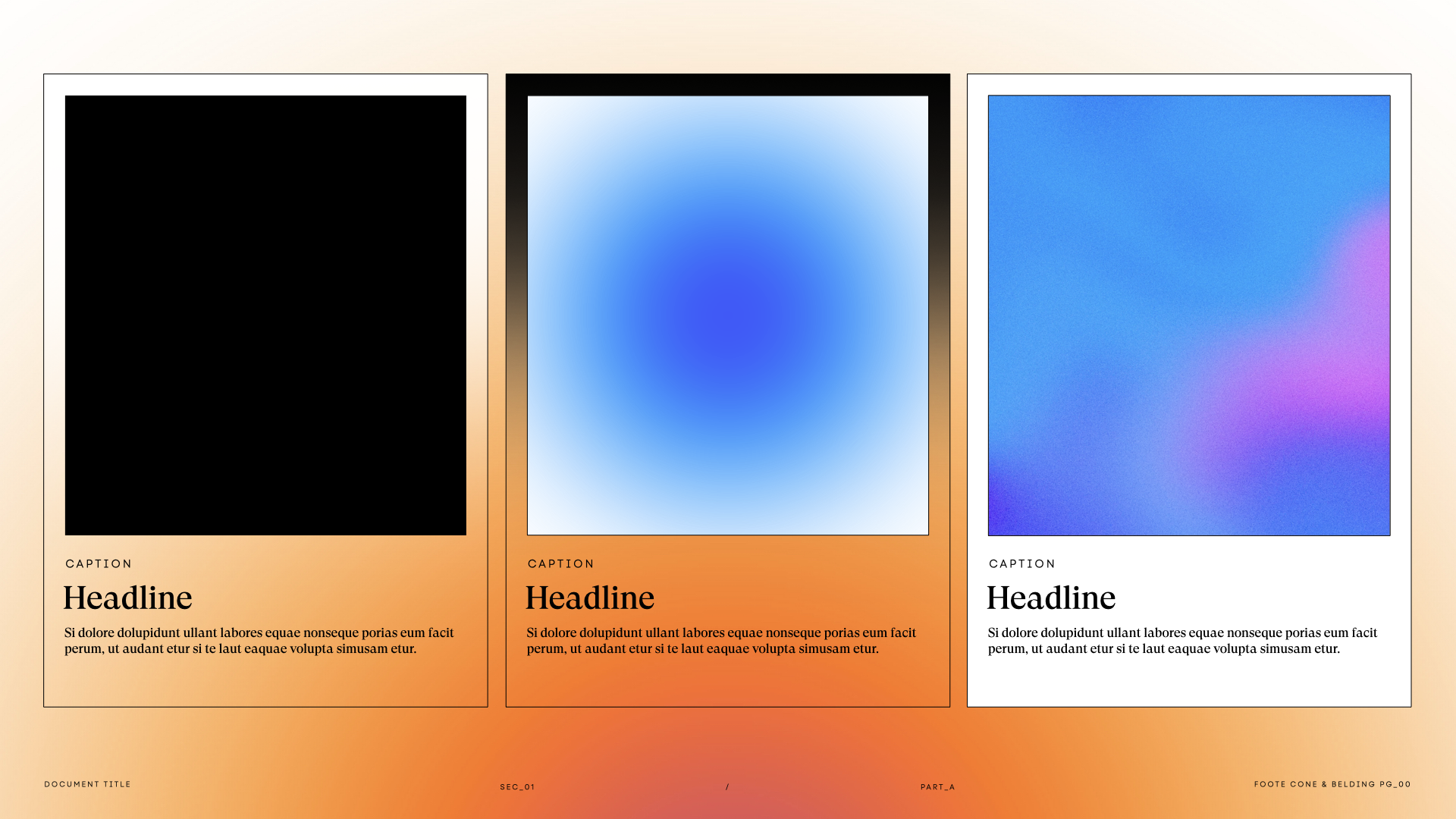
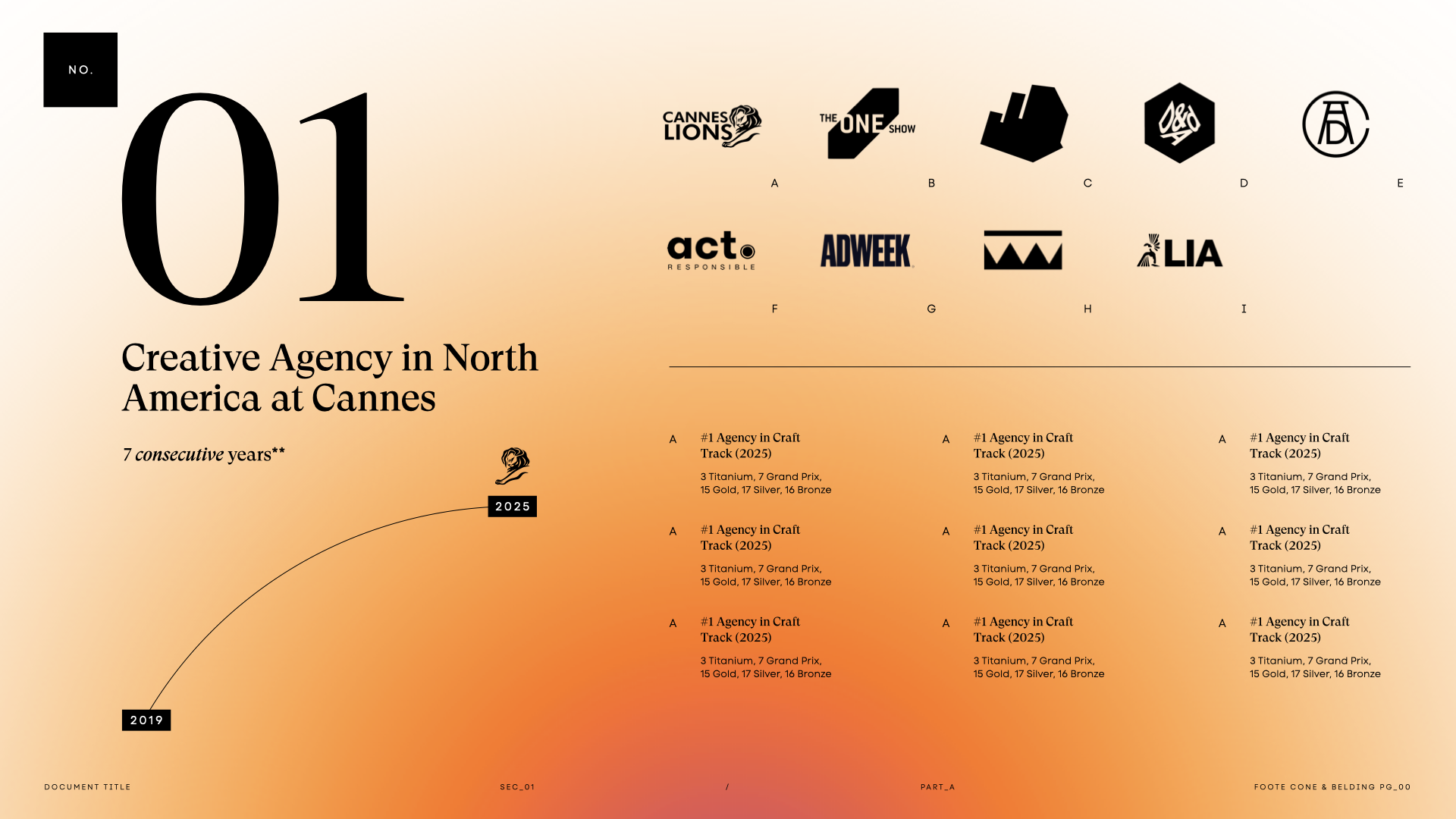
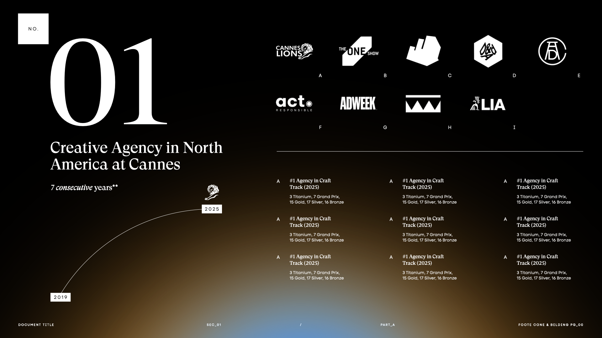
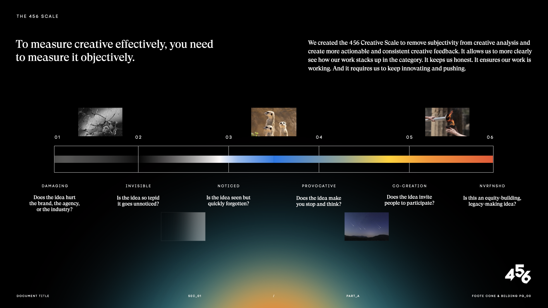
Being a presentation designer at FCB Chicago has radically transformed my thinking around presentation—from the way I present my thoughts to the larger group, to the way I show up dressed when stepping off that office elevator.
When I received my invitation back in 2020, I had no experience in marketing or advertising; just a deep-seated love for visual communication, and a sure and growing need for a change in scenery. I’ve since managed to challenge my own team’s out of the box thinking when it comes to design, and produce a body of ‘never finished’ work I’m proud to say I’ve had a hand in.
To ensure confidentiality compliance, select works have had their original copy substituted with placeholder text**
[ 007 ]
FCB CHICAGO